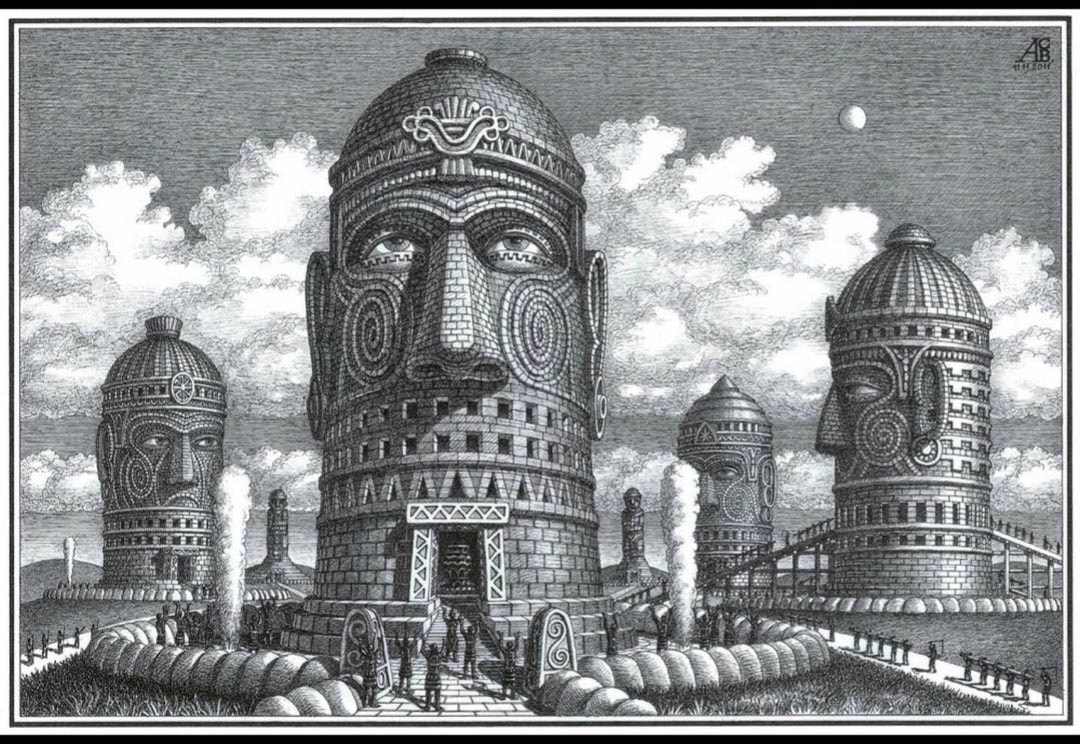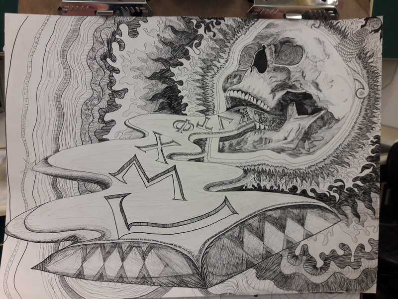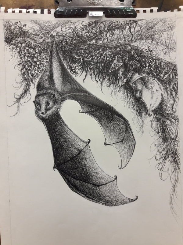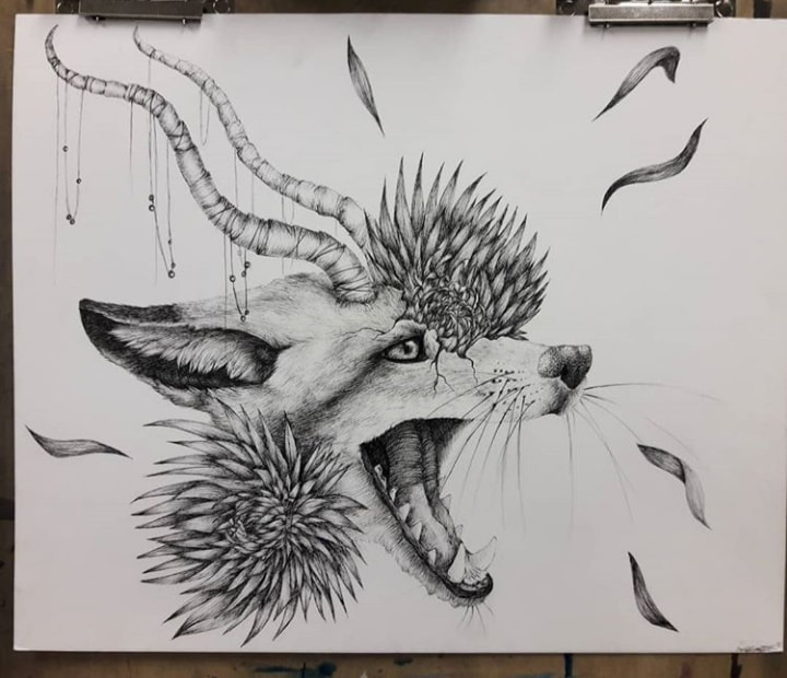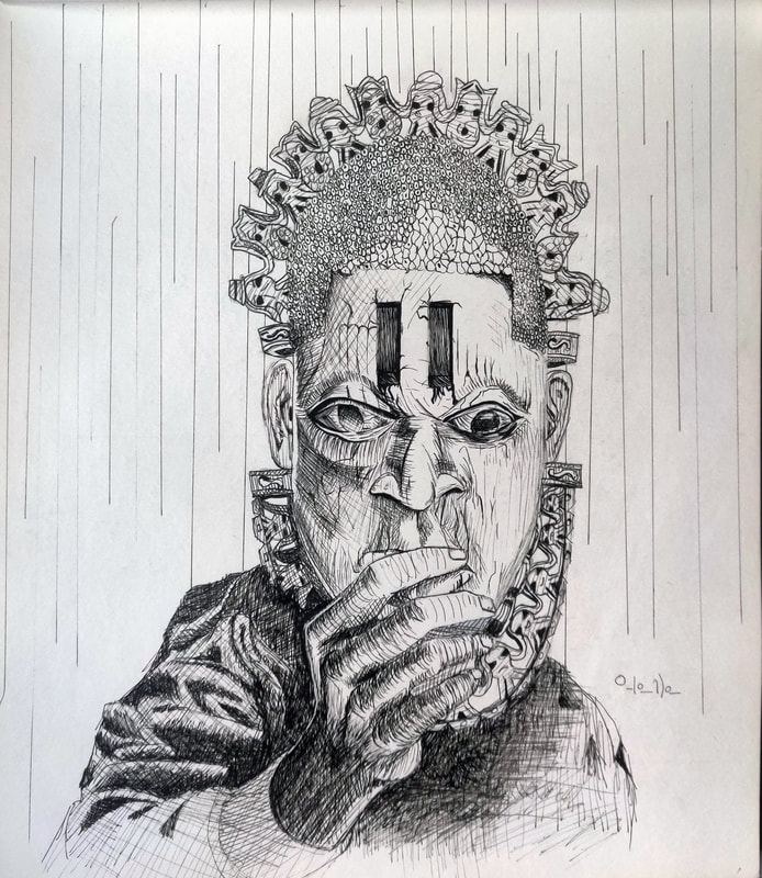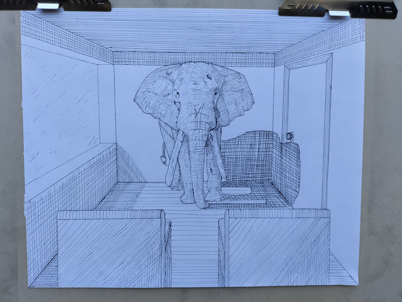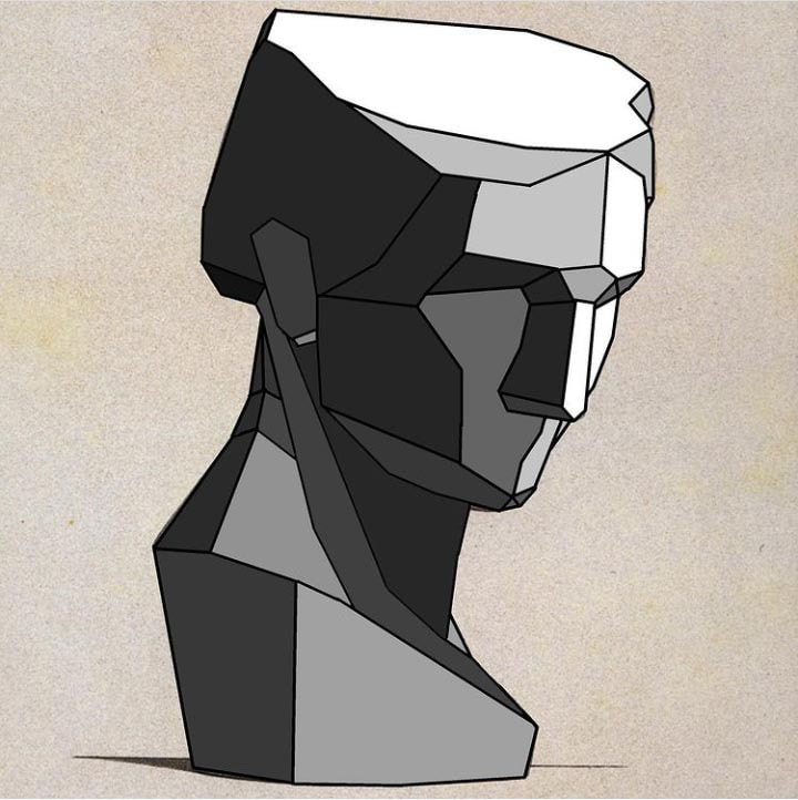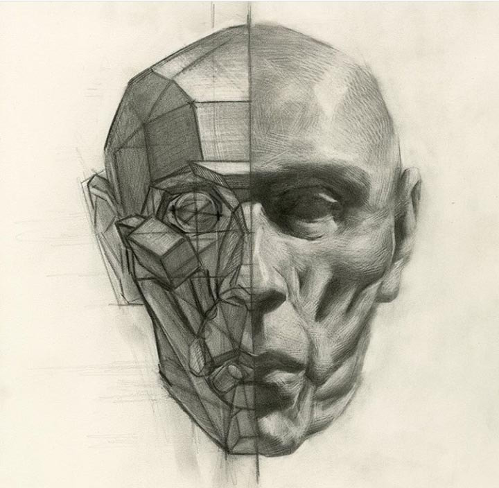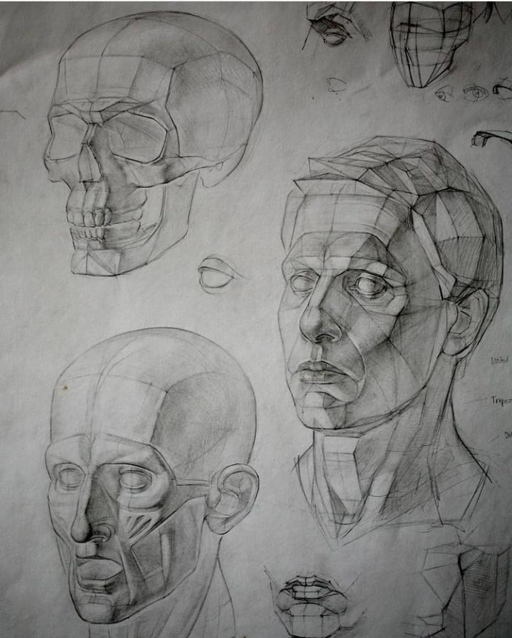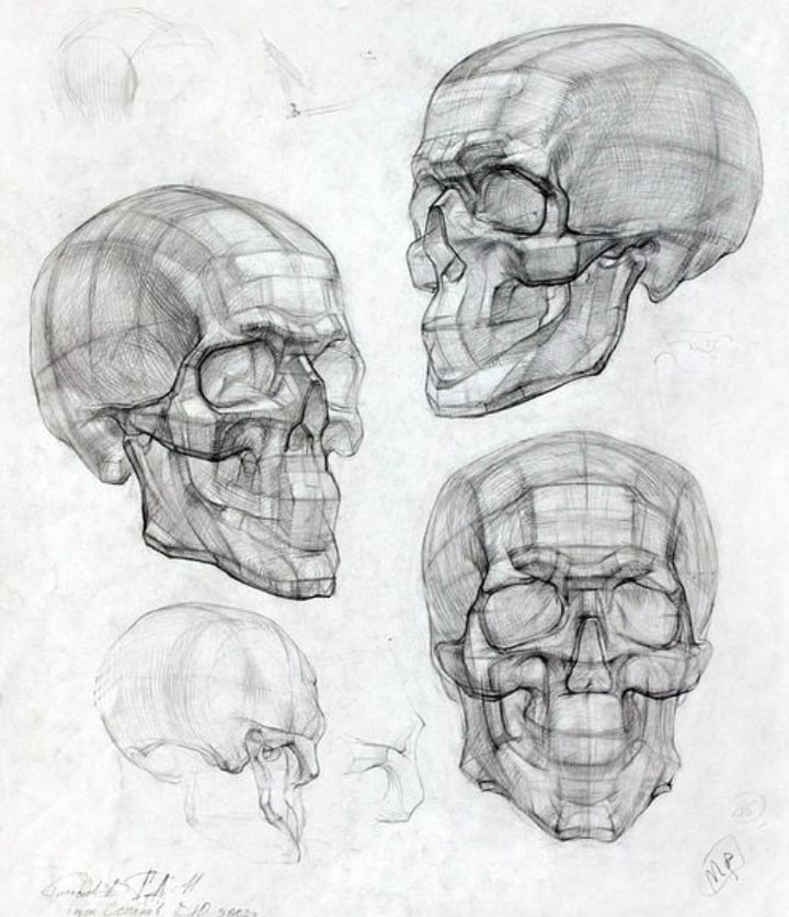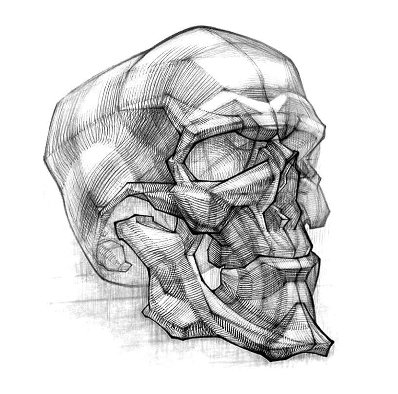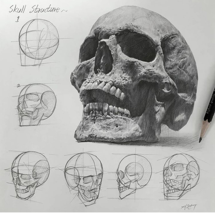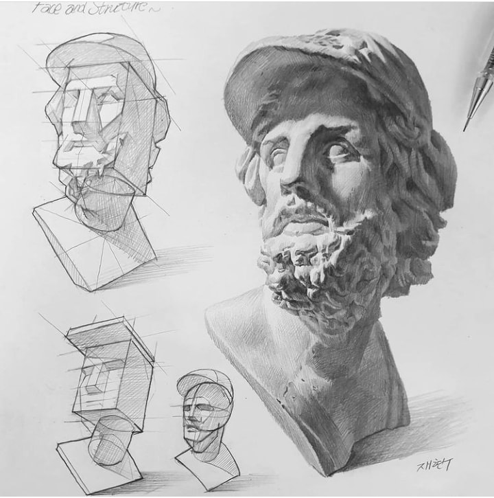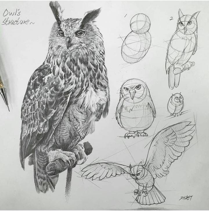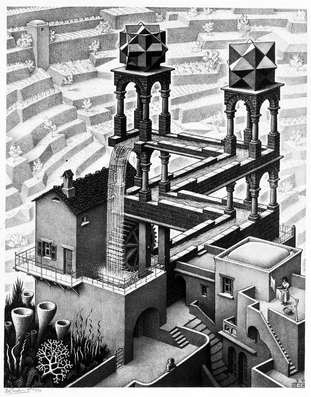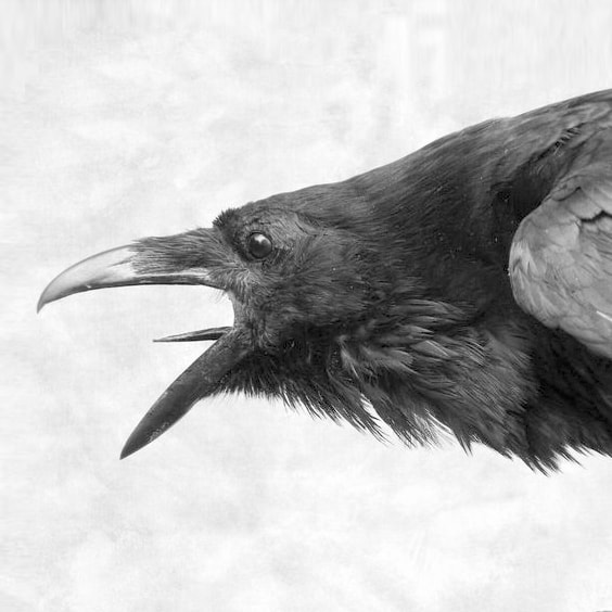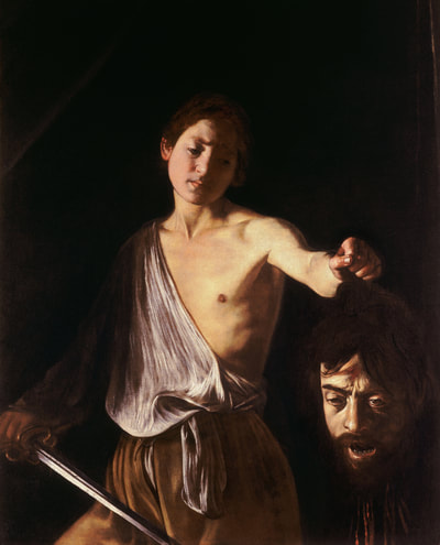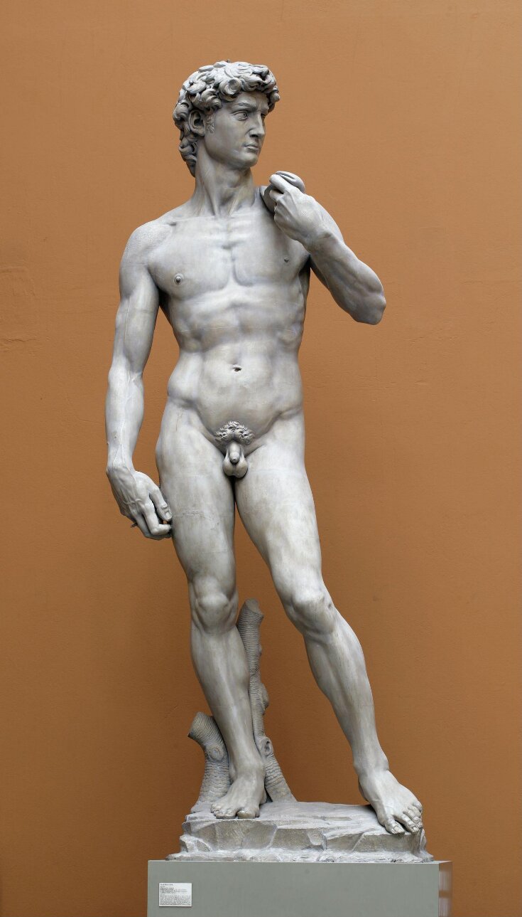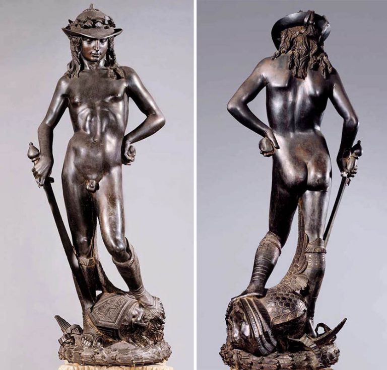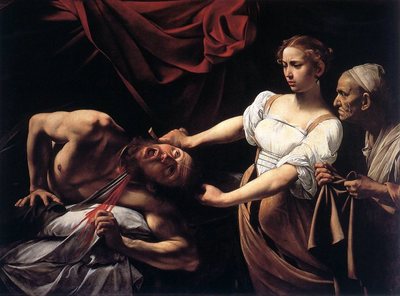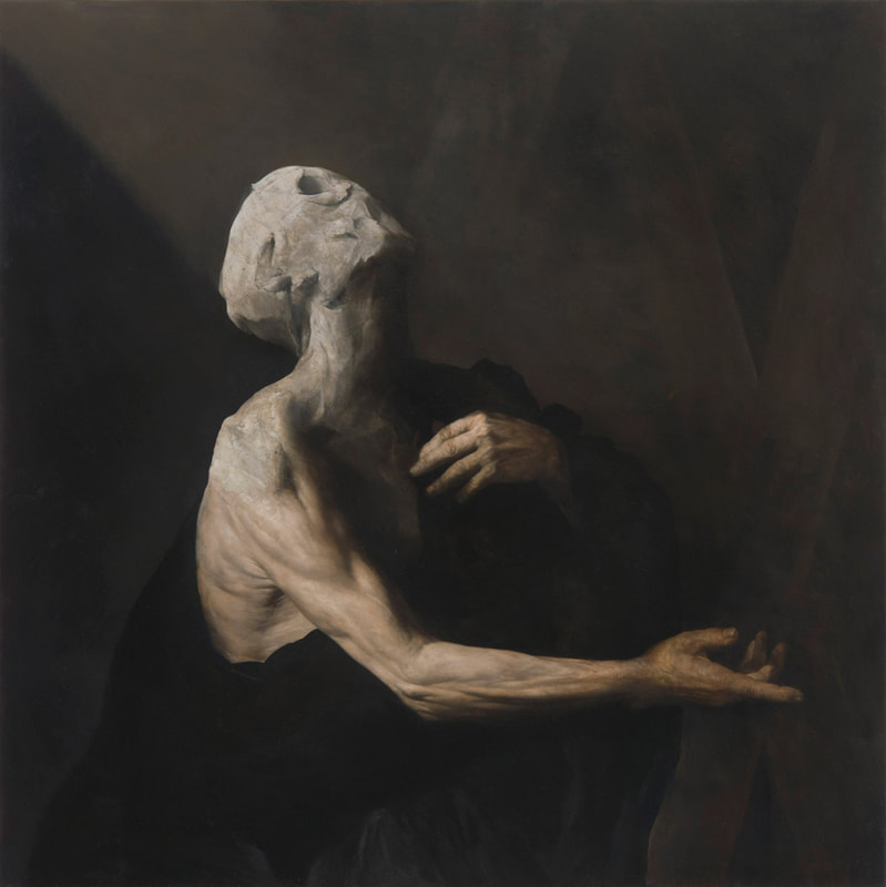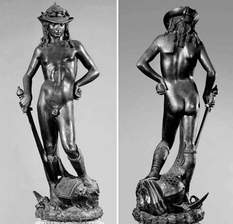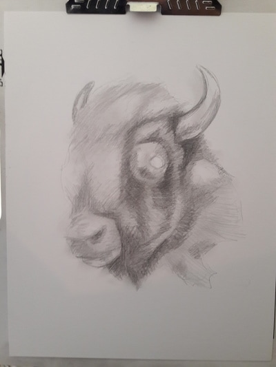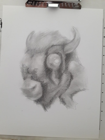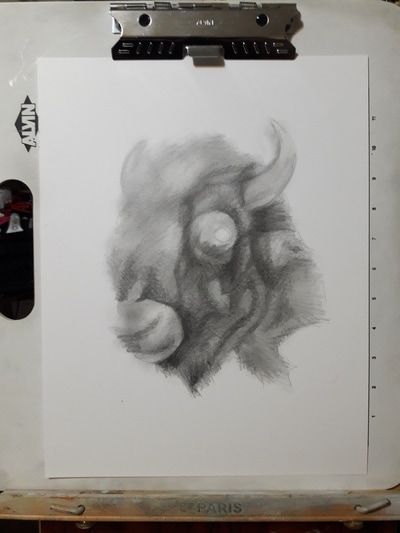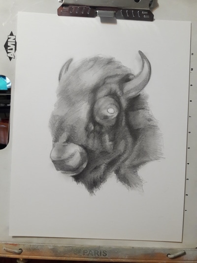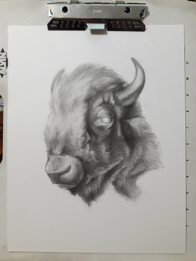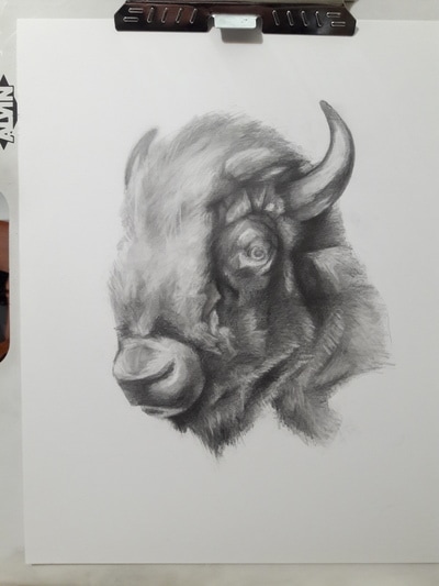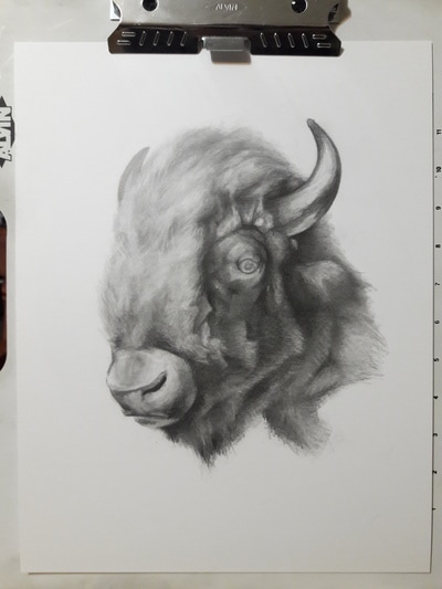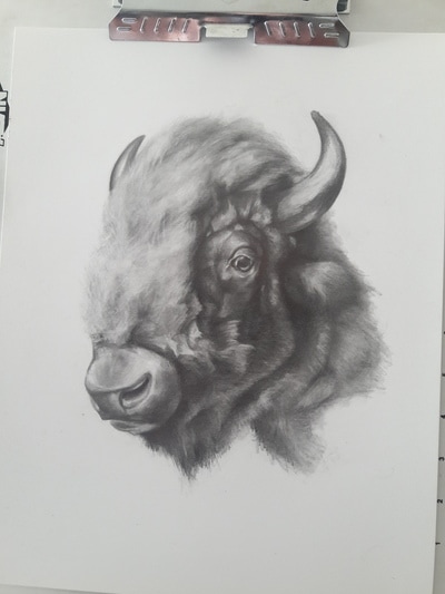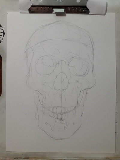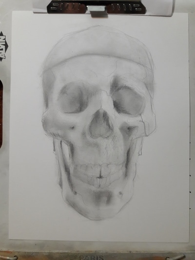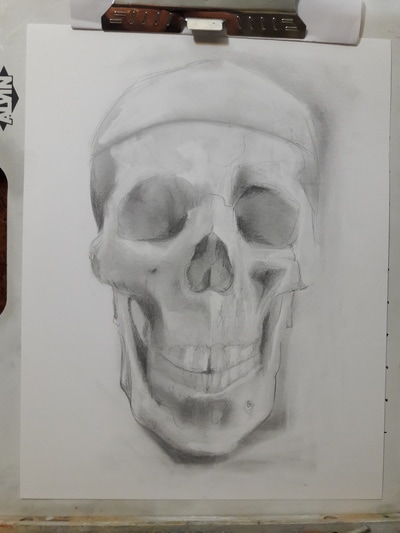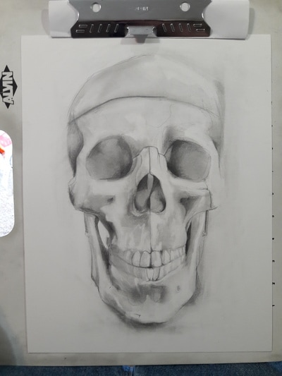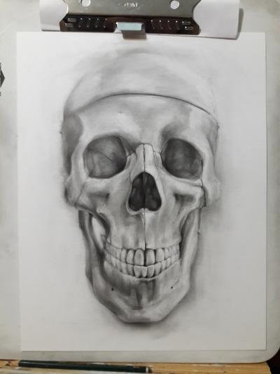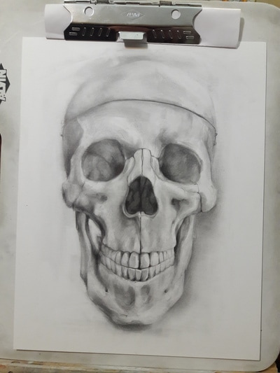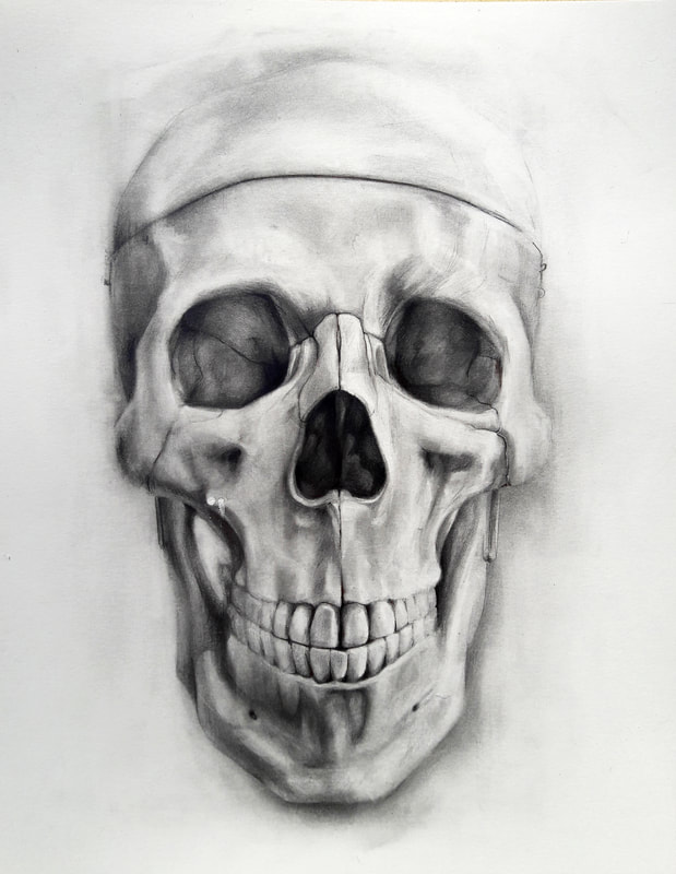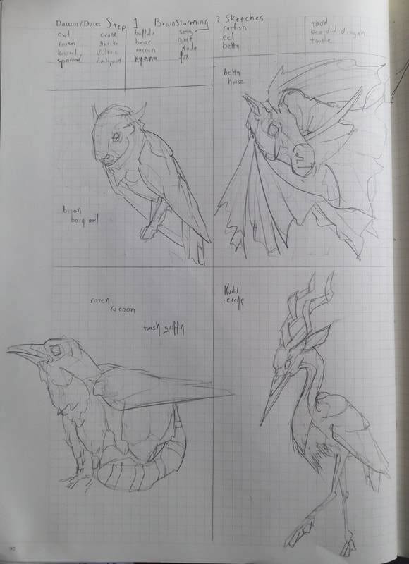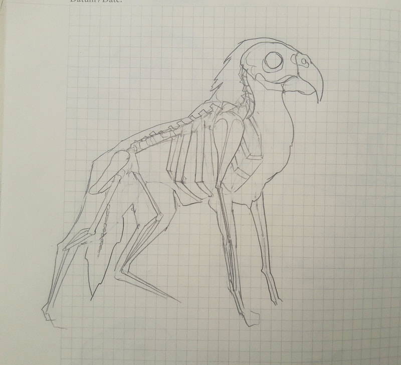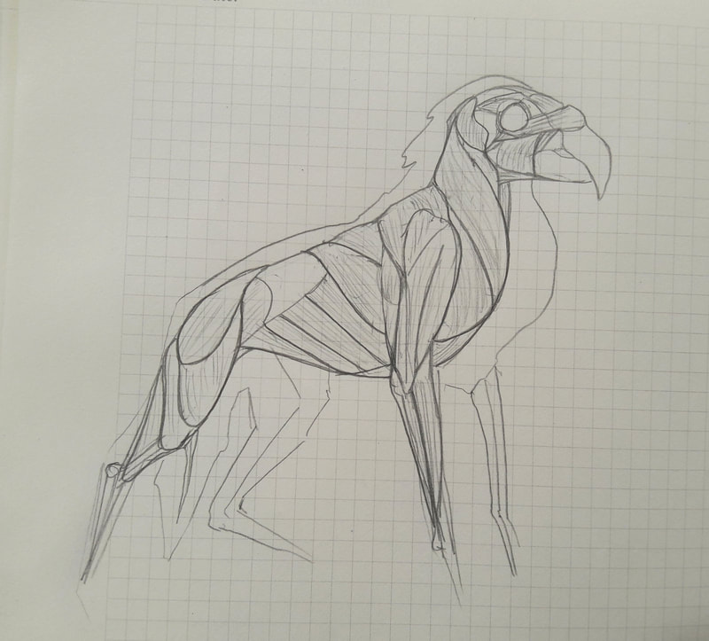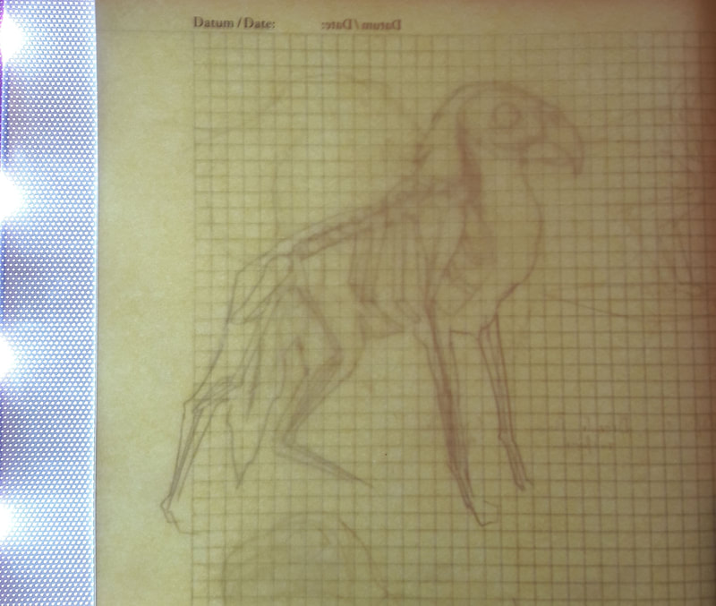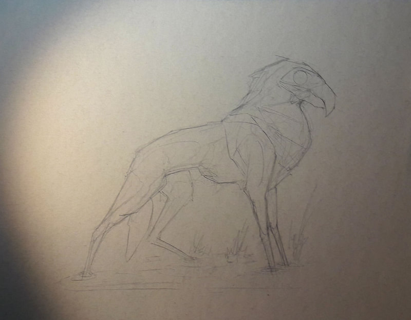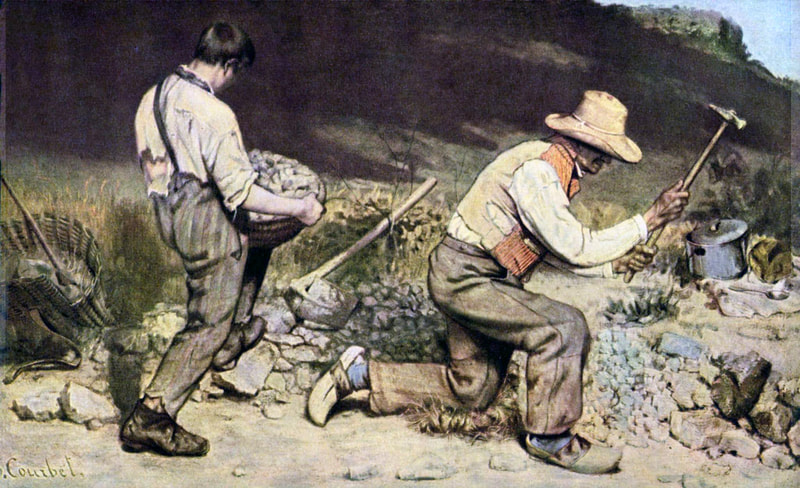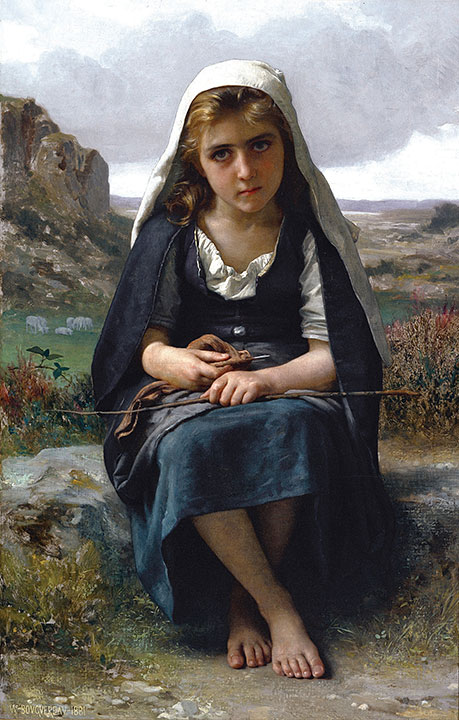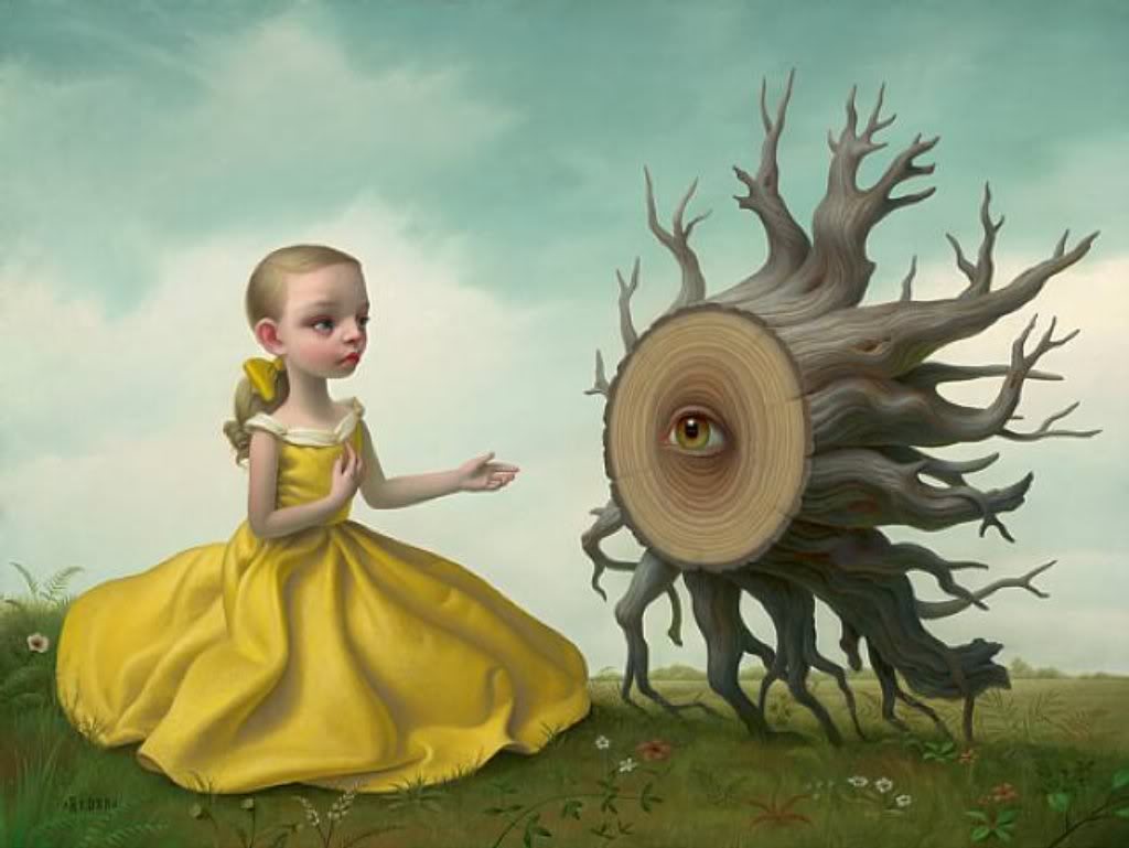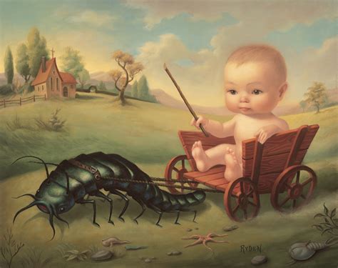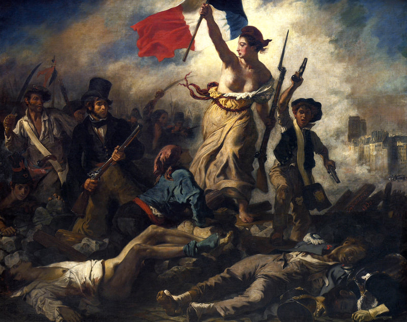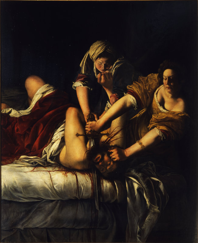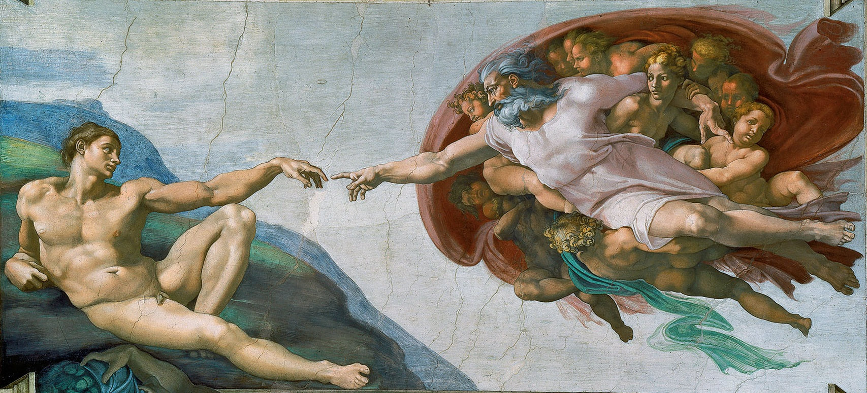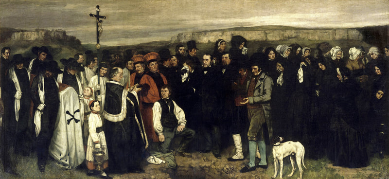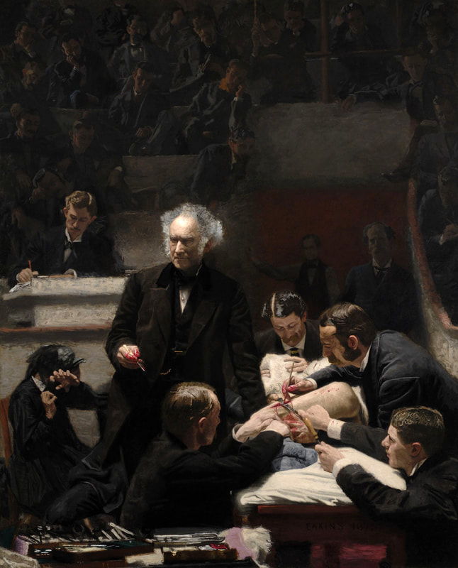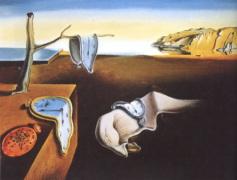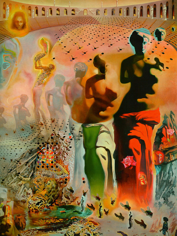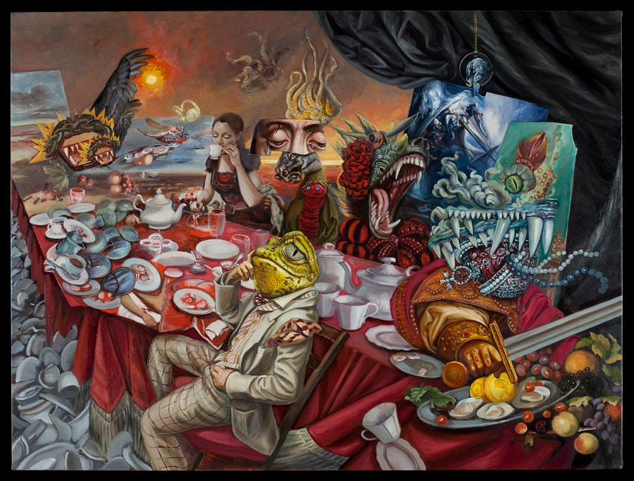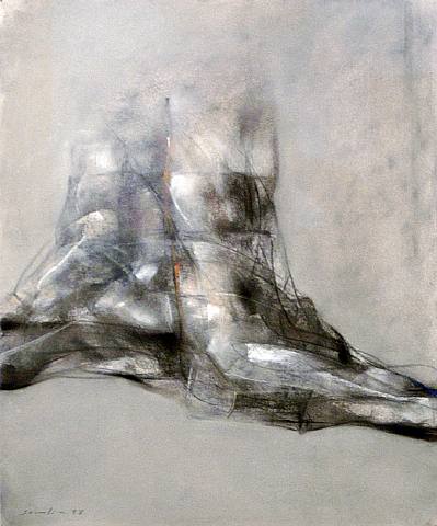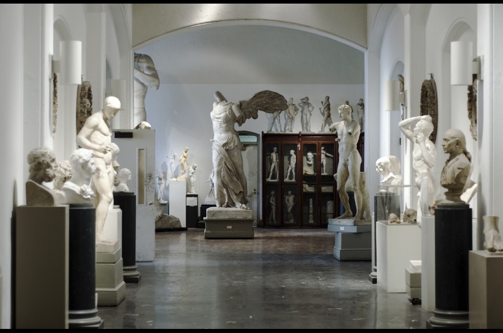
The Pennsylvania Academy of Fine Arts cast hall.
Introduction
Section 1
1.1 - Establishing Your Drawing Practice
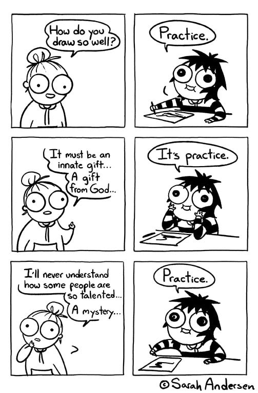
By far one of the biggest hurdles most of my students face is the psychological one of believing that they can learn to draw. Due to the lack of practical art instruction in most (grossly underfunded) public school programs, many students have had little to no exposure to any type of formal training in manual visual communication. As a result many of the students that have some ability to draw are often self taught, furthering the impression that some people "are just born with it." While it is true that each of our brains are "wired" differently and that some people exhibit an impressive proclivity towards skills such as drawing and painting with little or no guidance, the vast majority of us come to it through practice and instruction. Like any physical skill it's one that requires time, patience, and repetition as we explore techniques and build muscle memory. Outside of focused studies, if you want to improve your drawing abilities then set aside a little time each day just to sketch and draw what's around you, or just let your mind wander and see what comes out. I find it nearly impossible to find the time to sketch each day, which is why I make the time to sketch each day.
1.2 - Documenting Your work
When working remotely being able to document your drawings will be key to your success in the course. The following videos are excellent resources for documenting your work. If your photo's are unacceptable you will be asked to retake then. Ongoing issues will result in a loss of points.
Here are some quick points to remember in documenting your work.
Here are some quick points to remember in documenting your work.
- It is rarely as bright inside as you think it is. Since our pupils adjust to low light levels by dilating, we often have the impression that is brighter inside than it actually is. As a student I was always told to take pictures of my work outside. If it was sunny I should take a picture in the shade, and if it was overcast I should take my picture out in the open. The purpose of that was to take advantage of diffused lighting. Meaning bright, but not direct, lighting. This creates an even light level across your drawing. There are other ways to get even lighting in your pictures that are covered in the videos below.
- Make sure your camera/phone is parallel to your paper. This prevents a distortion in the image. Setting your drawing down flat on a table and then just taking a step back for a picture will not give me an accurate record of your work. There are several strategies gone over in the videos for how to make sure your pictures do not distort your drawings.
- Let your drawing fill almost the whole frame. I need to see the whole page of your drawing so I can get a sense of scale and composition, but I do not need to see your kitchen table.
1.3 - Materials
I think it's important to say a few words about the materials we'll be using before we begin drawing. When we talk about drawing materials, or any art making material we refer to it as a medium. The plural of that being media. So pencils, or graphite, is a medium. As is clay, paint, ink, metal, and so forth. It is the material that we use to articulate our thoughts whether that be visual or otherwise. When we use multiple materials we will use the term mixed media to signify that we are using multiple art making materials. Typically the surface that we work on for drawings or paintings is not spoken of as a medium, so a pencil drawing on paper is not considered mixed media.
Our primary medium will be graphite. Graphite is a crystalline form of Carbon, one of the primary elements that all life on Earth is composed of. The word graphite comes from the Latin stems graf (to write) and ite (meaning stone). The literal translation then is writing stone. I learned recently that diamonds, which are another crystalline form of Carbon, are formed by both intense heat and pressure and require that sustained heat and pressure in order to retain their form. When diamonds are brought out of those conditions they begin the slow transformation into graphite. It's a process that takes many thousands of years to actually occur, but it is happening nonetheless.
Graphite is rated using an HB system. This describes the amount of clay mixed with the graphite to change the hardness of it. Harder forms of graphite are labelled with an H, the H here signifying hardness. This means that higher the number next to the H the more clay is mixed with the graphite so the harder it is and therefore the lighter the mark. IE; 6H pencil would make a much lighter mark than a 2H pencil. On the other end of the scale we have the B's. B here means blackness, which refers to the darker marks B pencils produce as they contain less clay mixed with the graphite and so are softer, hence the darker marks. IE; a 6B pencil would make a darker mark than an 2B. I've found the different brands of pencils don't always exactly produce the same type of mark, so it's often best to stick to one brand for your kits. Personally I'm fond of Staedtler and Faber Castell, but I'm not that particular. Later we'll work with graphite sticks.
Other pertinent materials that we'll be working with are:
For my courses I do my best to keep the required materials down to what I consider the most essential ones. Sometimes in my demonstrations I'll bring in media or tools that are not included in my kits. When I do I'll make an effort to recommend easy to find substitutions.
Our primary medium will be graphite. Graphite is a crystalline form of Carbon, one of the primary elements that all life on Earth is composed of. The word graphite comes from the Latin stems graf (to write) and ite (meaning stone). The literal translation then is writing stone. I learned recently that diamonds, which are another crystalline form of Carbon, are formed by both intense heat and pressure and require that sustained heat and pressure in order to retain their form. When diamonds are brought out of those conditions they begin the slow transformation into graphite. It's a process that takes many thousands of years to actually occur, but it is happening nonetheless.
Graphite is rated using an HB system. This describes the amount of clay mixed with the graphite to change the hardness of it. Harder forms of graphite are labelled with an H, the H here signifying hardness. This means that higher the number next to the H the more clay is mixed with the graphite so the harder it is and therefore the lighter the mark. IE; 6H pencil would make a much lighter mark than a 2H pencil. On the other end of the scale we have the B's. B here means blackness, which refers to the darker marks B pencils produce as they contain less clay mixed with the graphite and so are softer, hence the darker marks. IE; a 6B pencil would make a darker mark than an 2B. I've found the different brands of pencils don't always exactly produce the same type of mark, so it's often best to stick to one brand for your kits. Personally I'm fond of Staedtler and Faber Castell, but I'm not that particular. Later we'll work with graphite sticks.
Other pertinent materials that we'll be working with are:
- Micron pens, a common brand name that produces archival ink pens. Archival means that the medium is pH neutral and will not change drastically with age if kept in the right conditions. Sharpies, while more common, are not archival and tend to yellow and disappear over time due to the high acid content.
- White plastic erasers are my eraser of choice, especially for beginning courses. I find pink erasers tend to be a bit hard, making it difficult to feel slight changes in pressure. On the other side of what is commonly available are kneadable. or gummy, erasers. They're like a softy putty and are great subtle effects, but lack the rigidity to make fine or calligraphic marks.
- Bristol Paper is a requirement for my more advanced courses. This is a thicker and smoother bright white paper. Since it is more smooth than most sketchbook or newsprint paper it takes materials a little differently. It is ideal for ink drawings and you can achieve more delicate and nuanced effects with graphite. It is also archival, and so will not begin to deteriorate within a few months or years.
For my courses I do my best to keep the required materials down to what I consider the most essential ones. Sometimes in my demonstrations I'll bring in media or tools that are not included in my kits. When I do I'll make an effort to recommend easy to find substitutions.
1.4 - Terms
In my courses there are certain terms we'll use on a regular basis. When I use an important term on this website I will put it in bold type. Below is a lexicon of the terms you should understand.
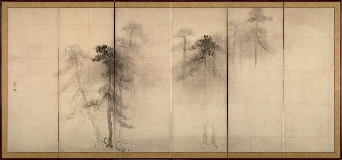
- Atmospheric Perspective: The effect that happens when objects are viewed at a distance through the atmosphere. Also called aerial perspective or sfumato. In single color drawings or paintings this is achieved by lowering the value range and burring the edges of distant objects. When using multiple colors objects in the distant are also cooler (more blue) so as to mimic the Earth's blue atmosphere.
- Diffused Lighting: Bright ambient lighting used here for documentation. See the video tutorials regarding documentation.
- Complex Contour Drawing: A drawing that not only describes the outside edge of your subject, but the outlines of various areas of light and shadow.
- Contour Drawing: A drawing that describes the edges of your subject.
- Convergent Lines: Diagonal lines in a linear perspective drawing that if extended would converge on or intersect with a vanishing point.
- Illusionistic Space: A representation of a 3D space on a 2D surface.
- Hatching and Cross Hatching: Drawn lines used to indicate value and sometimes surface shape. Hatched lines are parallel to each other, cross hatched lines intersect with each other.
- Horizon Line: A representation of the Earths horizon. Literally where the Earth meets the sky.
- Medium: The material you use to create a drawing, painting, or sculpture. The pluralization of medium is media, as in mixed media.
- Proportion: Here describing the accurate placement of features of your subject in a drawing.
- Sight measuring: A collection of techniques used to evaluate the proportions of your subject.
- Sketch: A quick and rough approximation of your subject. No details should be provided, only the general shapes of what it is you are drawing.
- Still Life: An arrangement of objects carefully lit for you to draw from.
- Subject: The object, objects, or scene that you are drawing.
- Value: The relative amount of light and darkness in your subject.
- Vanishing Point: A point in linear perspective drawings that all convergent lines meet at. In one and two point perspective vanishing points are all located on horizon line. In three point perspective two of the vanishing points are located on the horizon line with the third being located either above or below it.
1.5 - Setting up your work area and still life
A well set up drawing area is essential in facilitating your drawing studies. A thoughtfully arranged studio is by far the students best option, but unfortunately that option is not always available. It is up to the independent student then to create a space that is conducive to learning. What's most important is that you have access to at least 2 lamps. Ideally one should be a directional light, meaning that you can point the bulb in the direction you need. You will need this to light the still lives you will be creating for some of the drawing exercises. The other lamp you will place next to your drawing area so that you can see your paper clearly.
I have found that it is next to impossible to create a distraction free area outside of the studio as most students seem to feel more comfortable with a phone in their hand than without one. Nonetheless it's important to minimize visual distraction. I find putting on a instrumental playlist works well when I am studying, and that podcasts help when working on long drawings. Any outside visual stimulation, such as movement on a screen, will detract from your ability to work. I have screwed up more than a few good drawings because I decided to put on a movie while I was working.
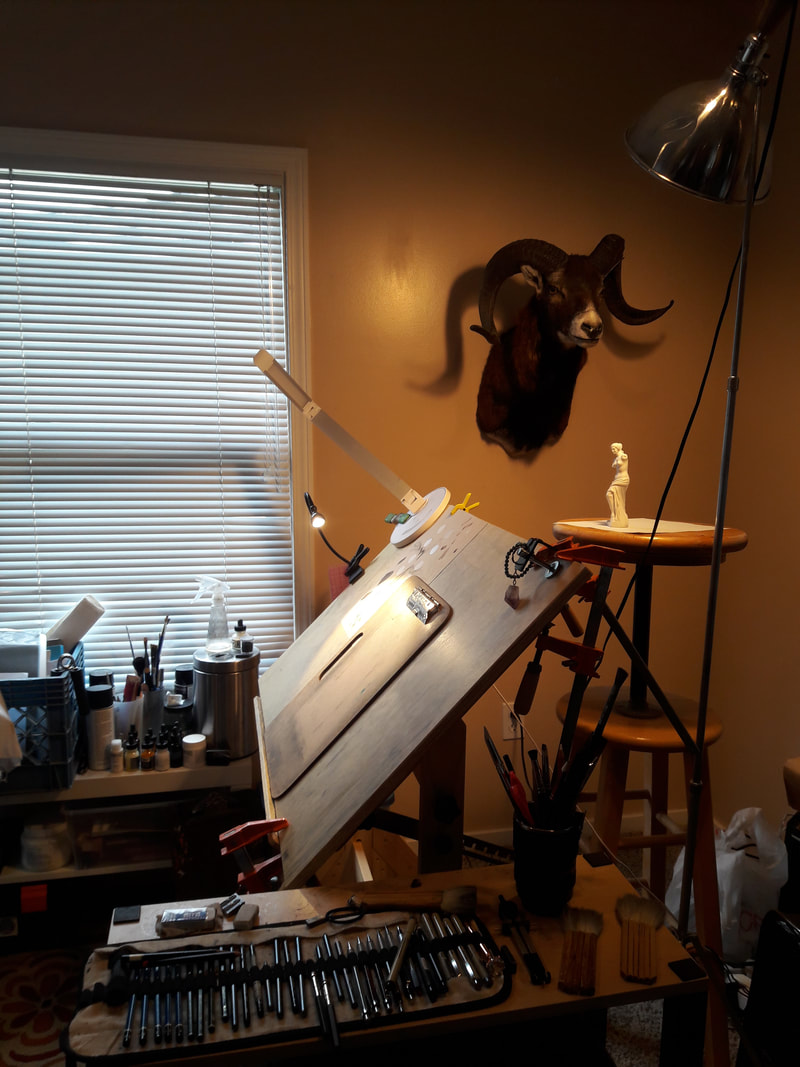
Below is my drawing area. It's doubtful that students will have access to everything depicted, but at least you'll get a sense of the direction you need to move in for a dedicated work space.
When setting up a still life at an introductory level it's important to choose objects that have certain qualities that will work in your favor as you focus on building your skills. I recommend choosing pale objects that will allow you to focus on the light and shadows. In traditional drawing studios aspiring artists typically begin with drawing from plaster casts. The picture at the top of the page is the cast hall from the Pennsylvania Academy of Fine Arts where I did my graduate work. This is where first year students spend much of their time studying and where both professors and advanced students come to clear their minds.
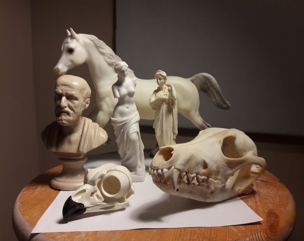
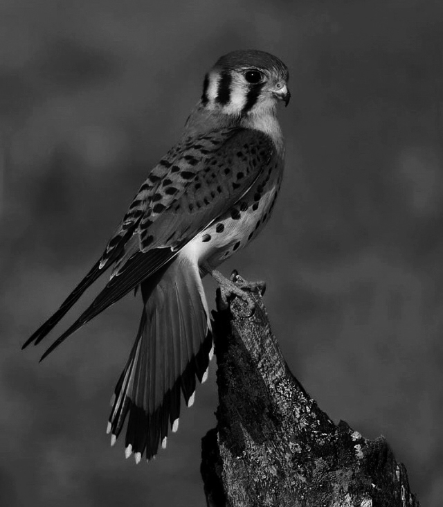
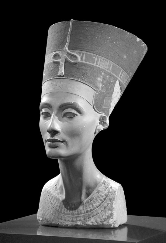
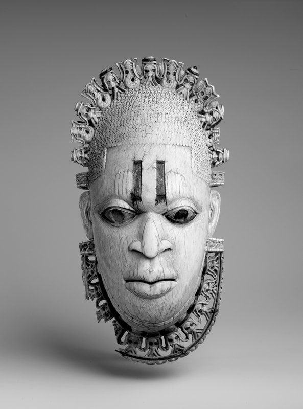
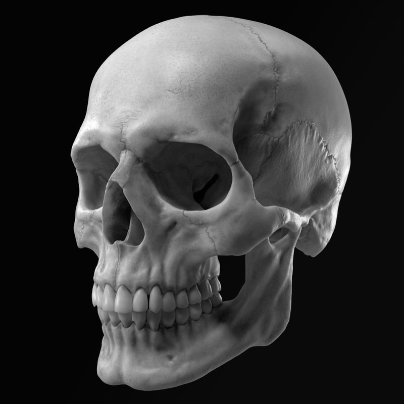
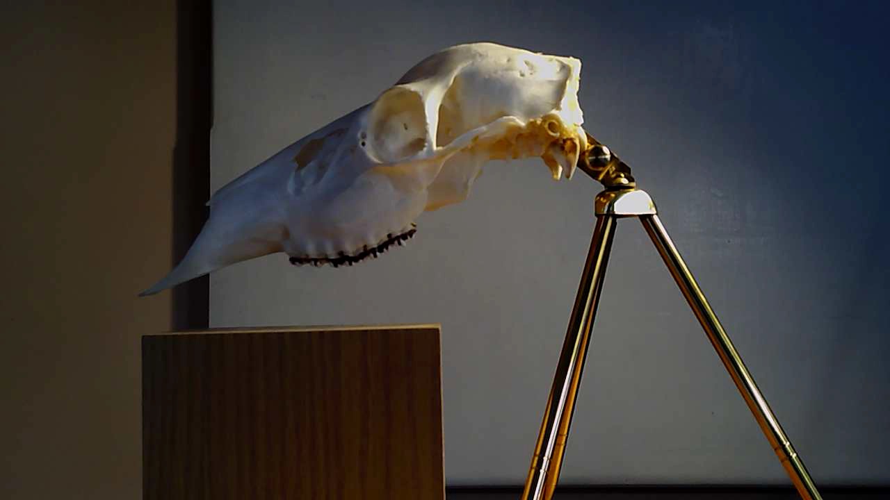
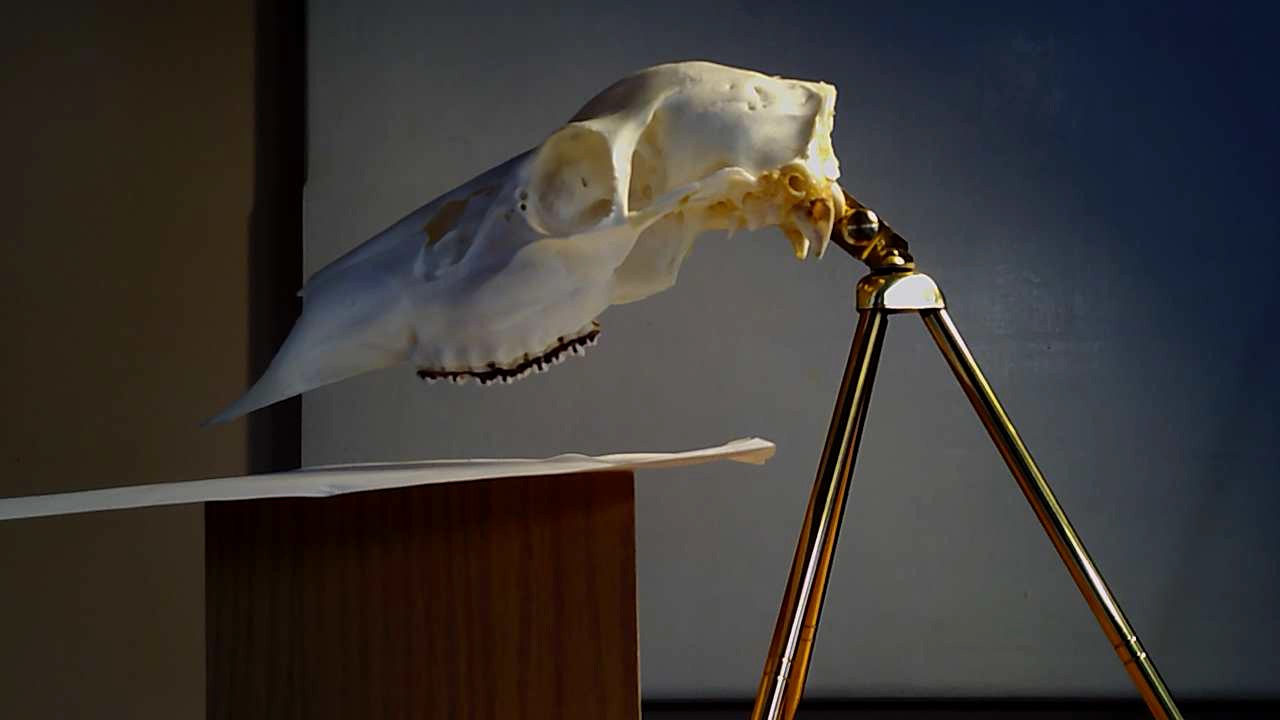
Other than being pale you will want to choose subjects that are neither too simple, nor too complex. Clean lines and curves without much surface texture. Other than plaster casts I often start my students on masks that I've painted a light tan, or some of our larger and less complicated animal skull replicas. Below are some small drawing subjects from my own curio collection. Anyone of these would be ideal for beginning students.
Other than being pale you will want to choose subjects that are neither too simple, nor too complex. Clean lines and curves without much surface texture. Other than plaster casts I often start my students on masks that I've painted a light tan, or some of our larger and less complicated animal skull replicas. Below are some small drawing subjects from my own curio collection. Anyone of these would be ideal for beginning students.
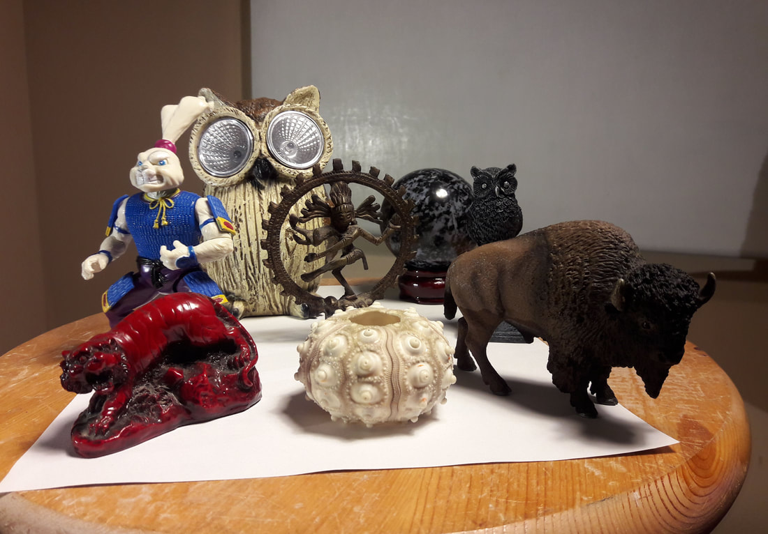
These are also some selections from my curio cabinet. I would say that none of these would be a good fit for beginning students as they fail to meet our ideal criteria. Too much visual or surface texture, muddled shapes, and multiple colors can needlessly complicate your early drawings.
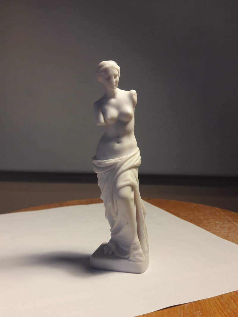
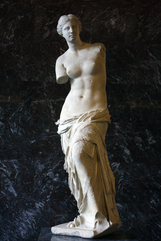
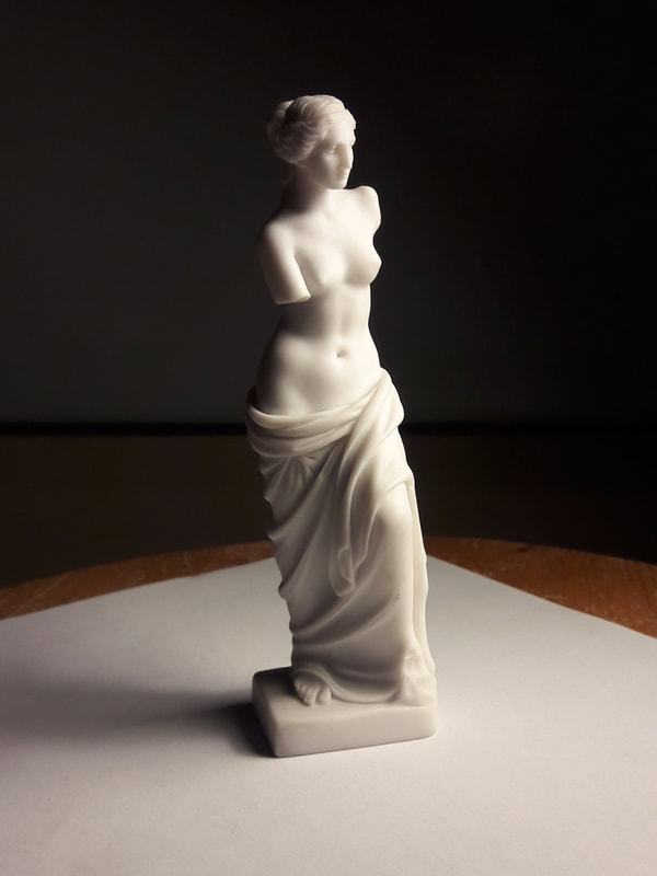
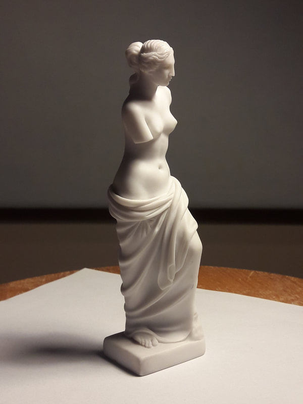
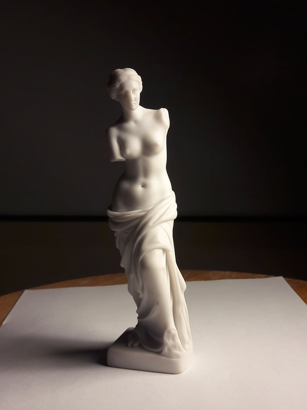
For my initial demonstrations I've chosen the small reproduction of Aphrodite de Melos, also known as the Venus de Milo. The original is a marble sculpture from around 100 BC most likely created by Greek sculptor Alexandros of Antioch. It was rediscovered in the 19th century with it's arms broken off and currently resides at the Louvre Museum in Paris. I bought my reproduction for about $4 at Value Village. It's a good subject in that the pale coloration allows me to focus on the levels of light and shadow, the form is clear and not overly complicated but neither is it too simple.
Don't just put your something down on a table and begin drawing. It's important to spend some time moving your light source and subject around so you can find the ideal lighting to describe what it is you are drawing. Here I raised and lowered my light source, turned the statue around, a few times, until I found an angle that worked for me. Your ideal lighting will give you different light levels across the surface. The more variety there is in the shadows, the better you will be able describe the shape of your subject. I chose the angle on the right for my drawing.
line and proportion
Section 2
2.1 - Complex Countour Drawings
The most basic of drawing elements is the line. It forms the foundation for all other marks in the academic tradition of observational drawing. In it's most ubiquitous usage, it forms a boundary between objects and space. The outline of subject, such as a person, is how children begin to depict the world around them. This perimeter is what we call the contour (French for shape).
From the contour we derive the complex contour. The complex contour not only describes the edge of your subjects form, but begins to generalize the areas of light and dark as discrete shapes. Visual information is communicated through the medium of light. So when drawing something from life or drawing an invented subject within an illusionistic space (believable 3D space), the artist is not drawing the subject, so much as the light reflected off the subject from an outside light source. For the beginner, by drawing the complex contours of our subject we are training the eye to begin to differentiate the elements of our visual field more consciously. This devotion to developing an increased visual awareness is quintessential to the academic tradition. Our goal is not just to look, but to see, the difference being a more acute sense of awareness. As I tell my youngest student, "The difference is that you understand what you're looking at."
Our other purpose for the complex contour is to build an accurate foundation on which students will later add value (light and shadow) to. When moving from a sketch to a complex contour students are able to make corrections relatively easy. As we learn proportion and how to place features correctly, students will find that it is much easier to change a drawing consisting of lighter lines than it is to correct something that already has a lot of value added.
2.2 - Sketching and the Complex Contour from still life
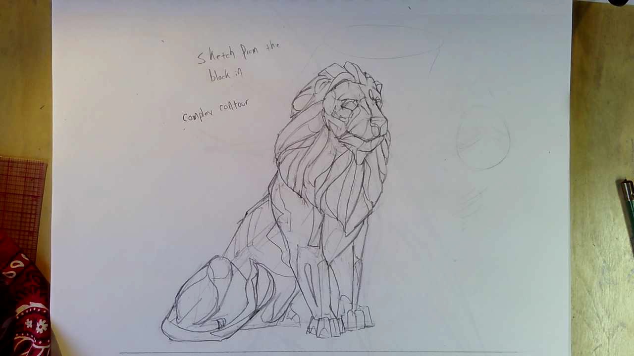
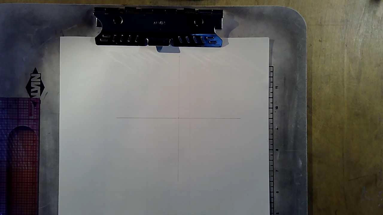
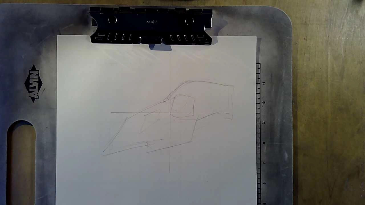
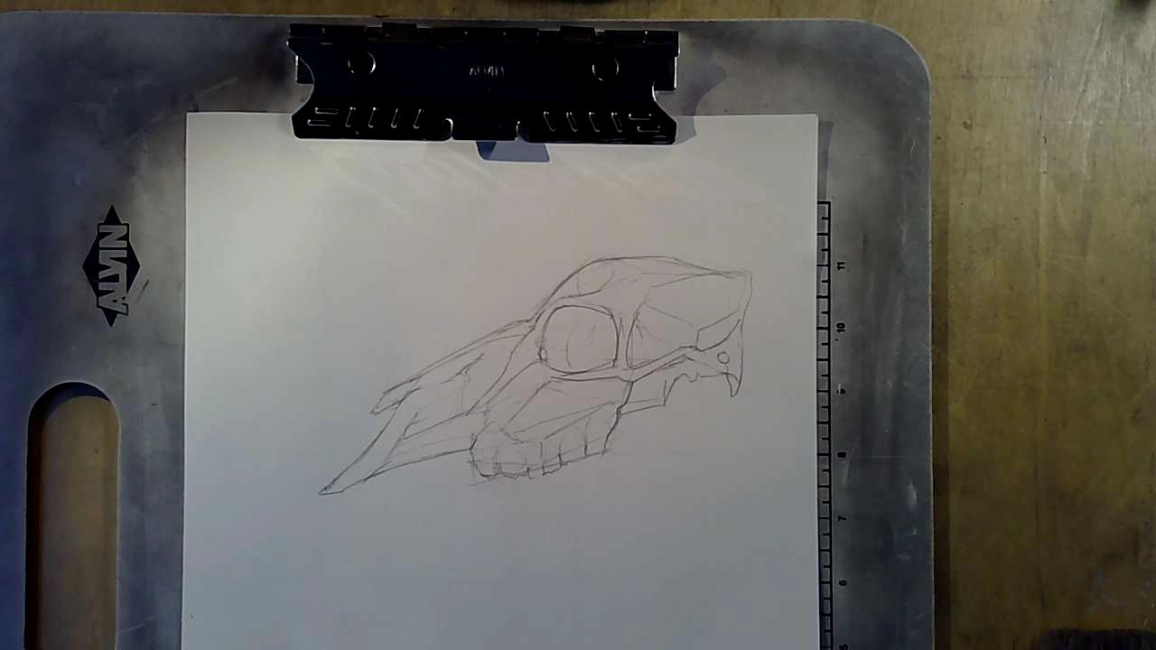
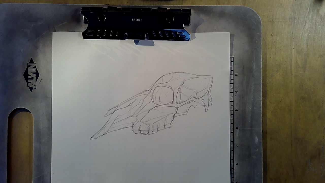
Below I will demonstrate how to first create a sketch of the subjects contours, then how to refine that sketch into a complex contour. Each of the pictures have captions about the process. You'll most likely be struggling with your proportions in this first drawing, don't worry about it too much right now. After this exercise we will introduce a technique that will help you to train your eye and hand in order to increase the accuracy of your drawings.
| venus_image.jpg | |
| File Size: | 33 kb |
| File Type: | jpg |
Below is a video of me drawing the Venus statue and explaining my process as I work.
2.3 - sight measuring for still lives
Now that you've drawn you first still life in complex contours we're ready to introduce a series of techniques called sight measuring that will help you create a drawing with accurate proportions. The next 3 video demonstrations will cover how to set up anchor points and how to evaluate the relationships between the different parts of your subject for your drawing.
2.4 Sketching And The Complex Contour From photo reference
|
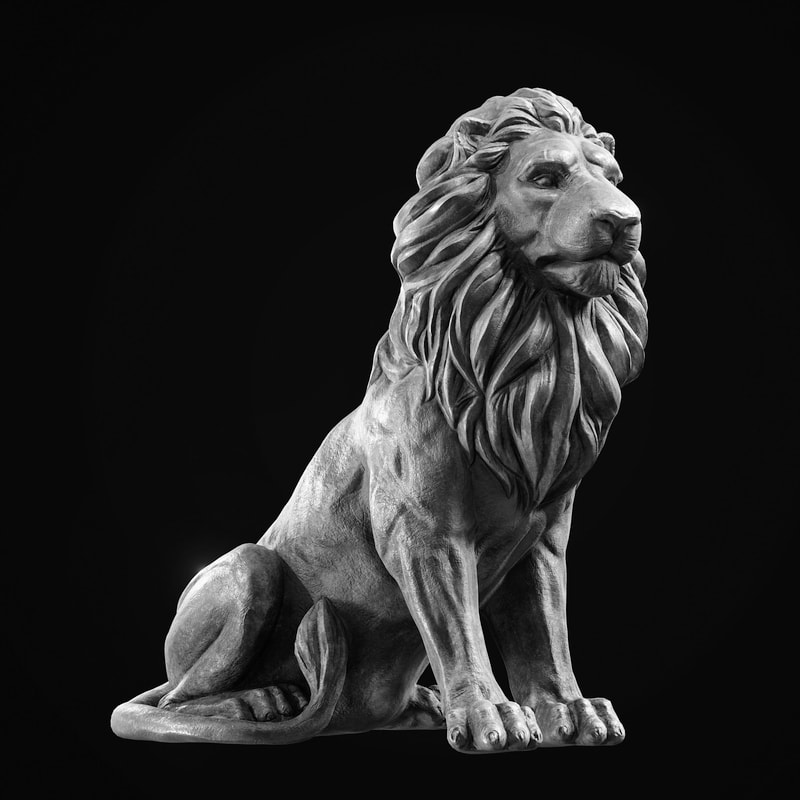
This section covers the same techniques as 2.2, though from a 2D source rather than 3D one.
Above is the image that I will be working from for the demo. I've attached a file for students to work to the right of this caption if they would prefer not work from the website. In the following three videos I describe and demonstrate the process of moving from a sketch to a complex contour drawing. |
| ||||||
2.5 - Working from a photo reference with an armature
|
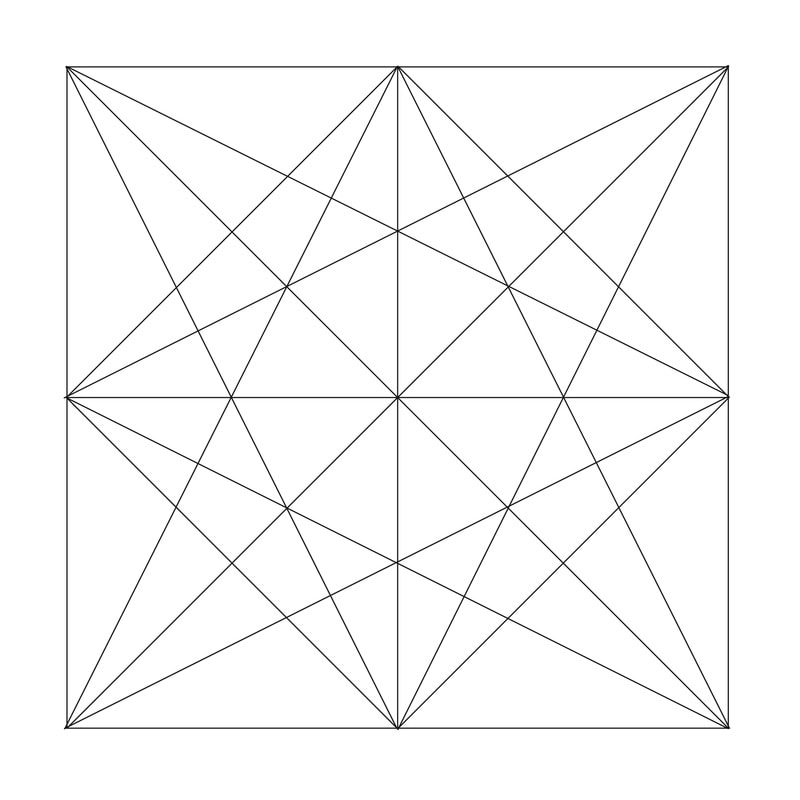
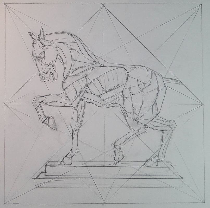
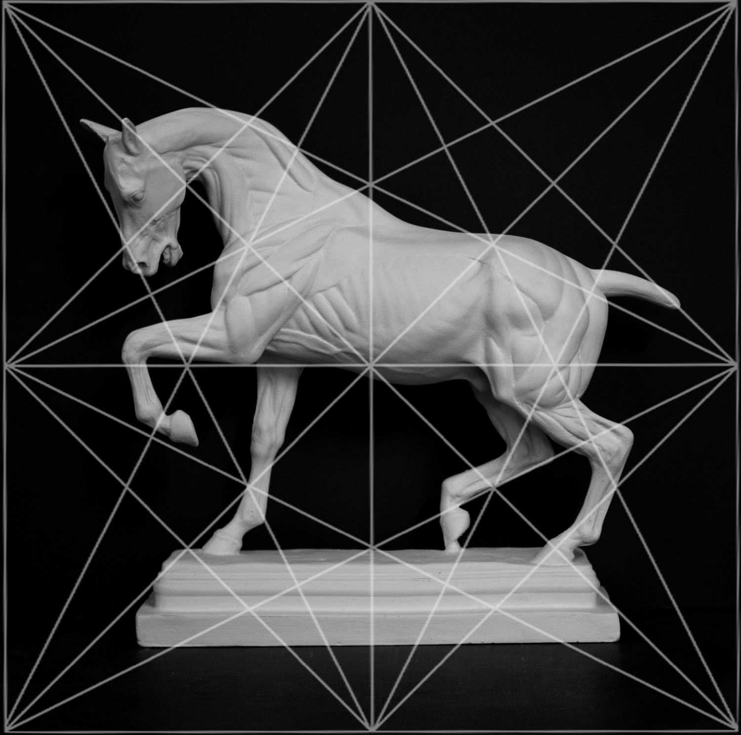
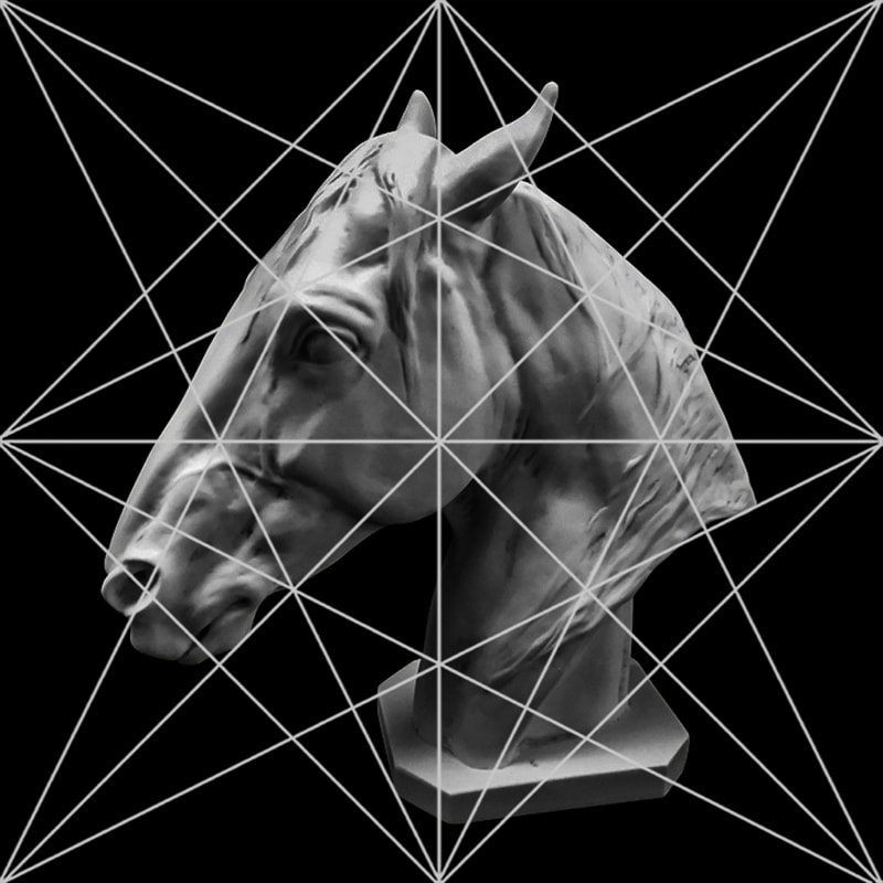
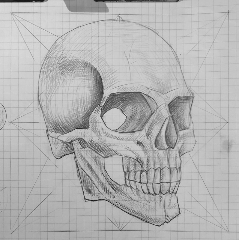
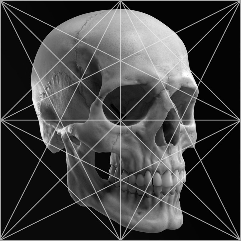
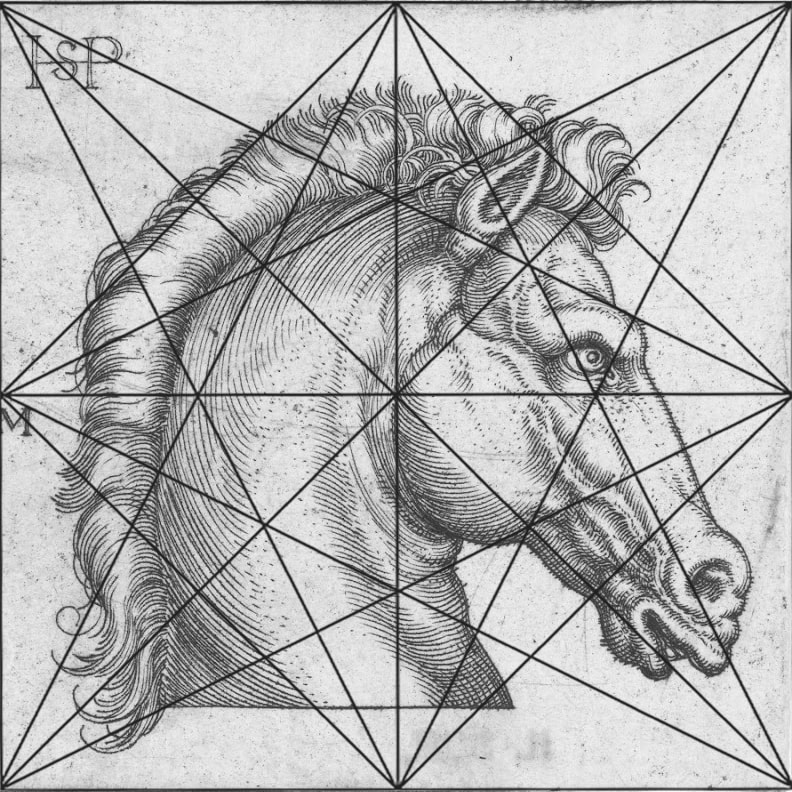
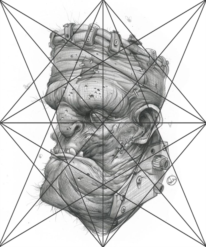
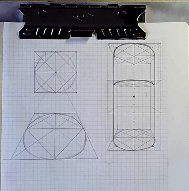
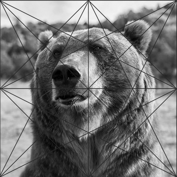
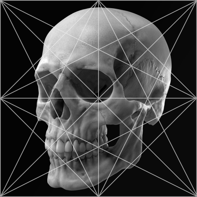
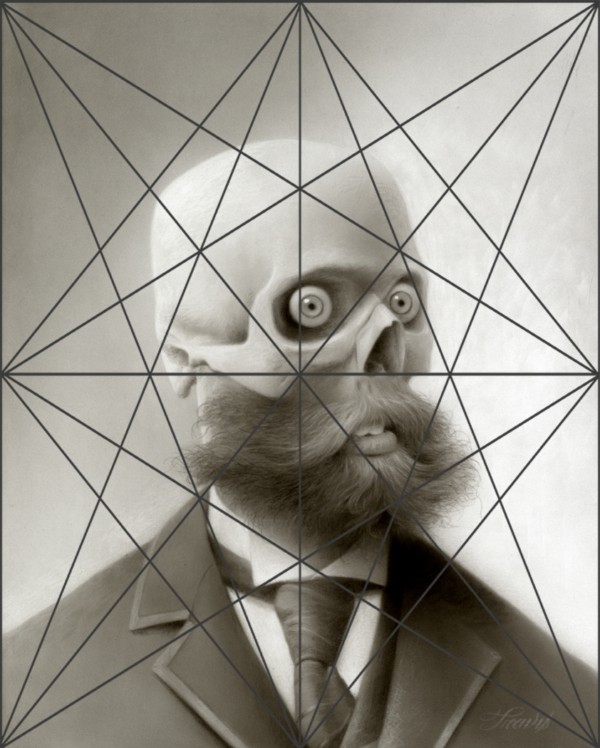
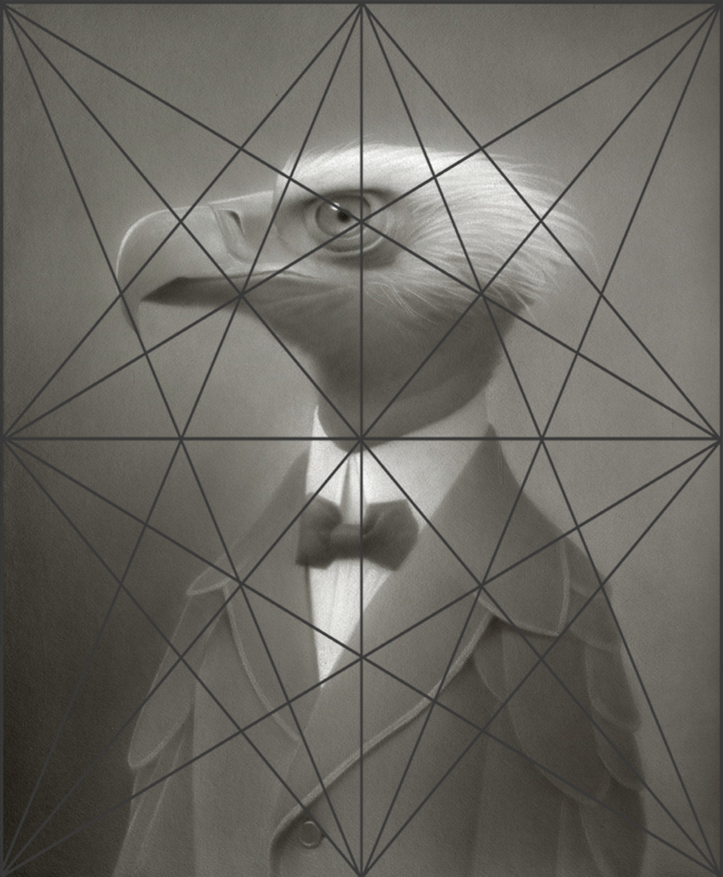
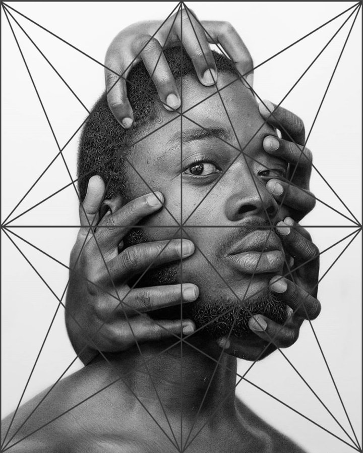
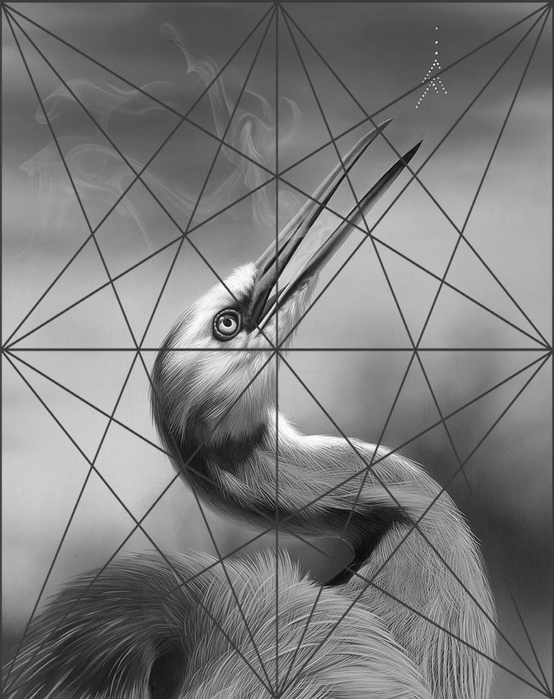
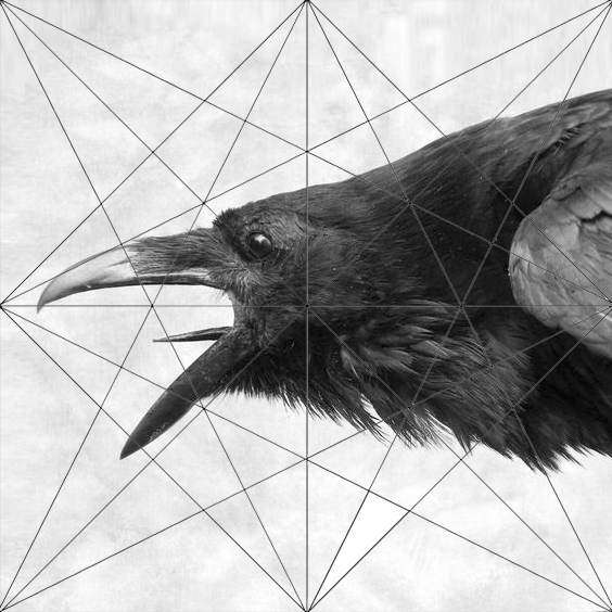
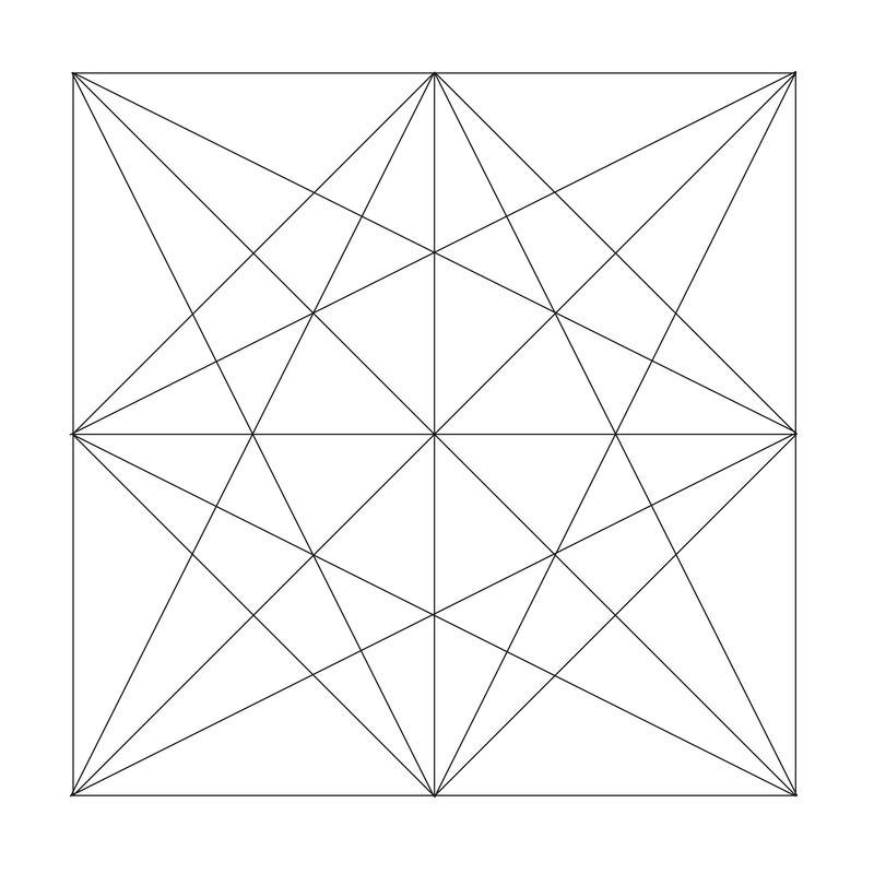
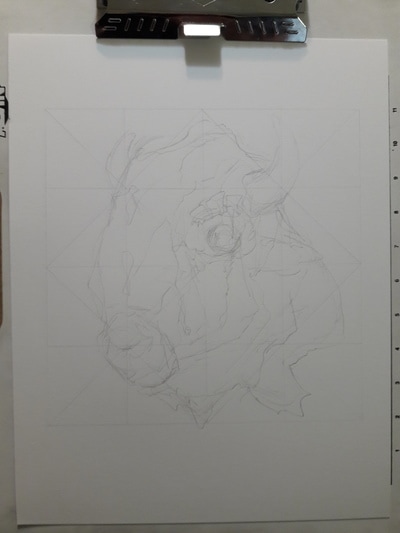
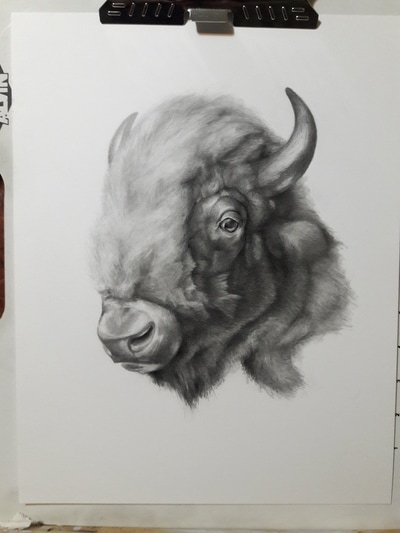
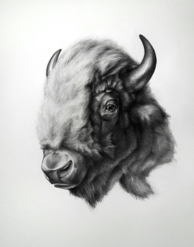
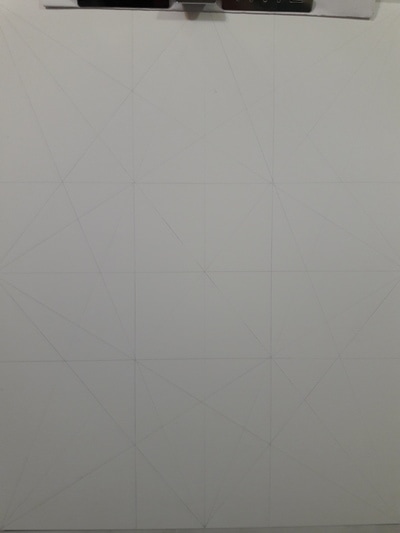
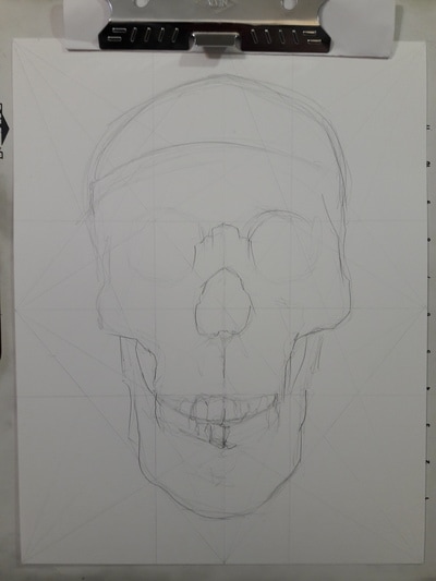
In this section we will look at two different structures to help students with their proportions. The diamond type structure is called the armature of the rectangle (see image to the left) and will typically just be referred to as "the armature" for short. This structure was developed by visual artists in the Italian Renaissance as a way to visualize harmonic divisions in space. A visual equivalent to the musical scale was more less the idea.
In later sections we will discuss it's use in composing scenes, but for now we will use it as a way to plot information on a page from a source image so as to correct our proportions. Watch the video below to see how I draw the armature and use it to reproduce a source image. |
Exercise 2.5 -1
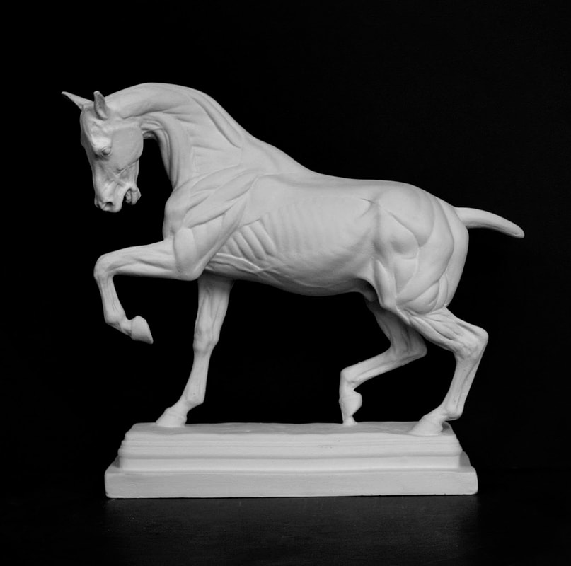
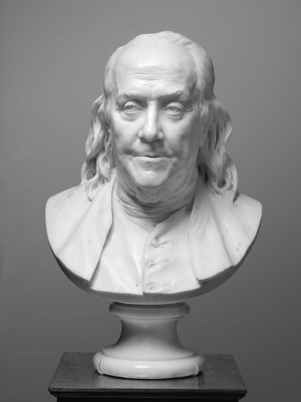
Below is the source image I will be working from. This sculpture is called an ecorche, meaning an anatomical study.
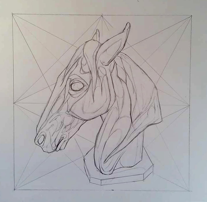
Below I demonstrate how to draw the armature and use it to place important features of our subject in the correct place.
Below is the finished complex contour drawing of the horse ecorche using the armature of the rectangle.
Below are the images students can work from when reproducing the horse ecorche.
|
| ||||||||||||
Exercise 2.5 -2
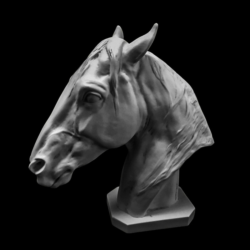
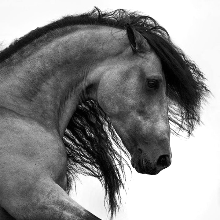
Below is another horse image for students to work from a long with the accompanying files and a time lapse demonstration.
|
| ||||||||||||
Exercise 2.5 -3
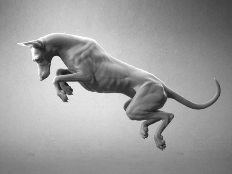
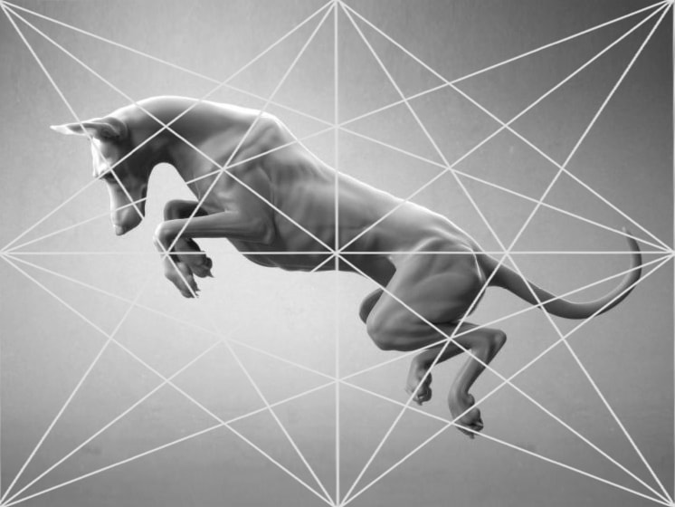
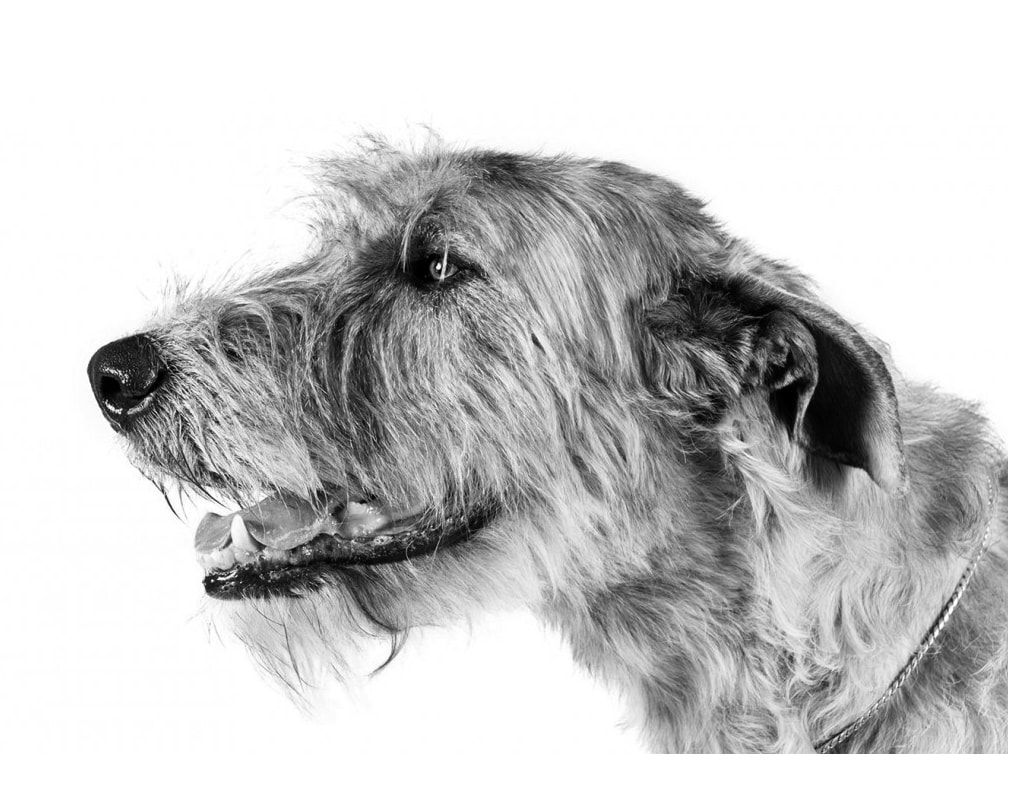
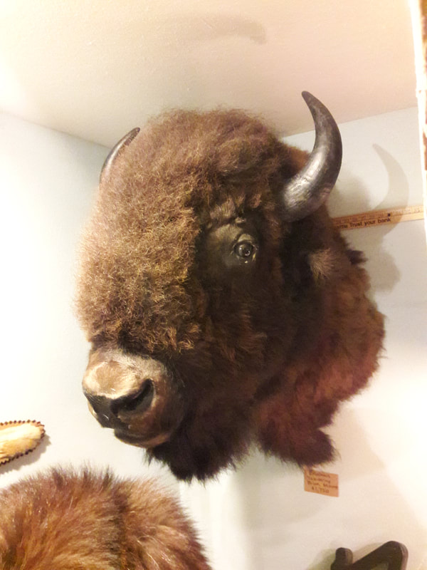
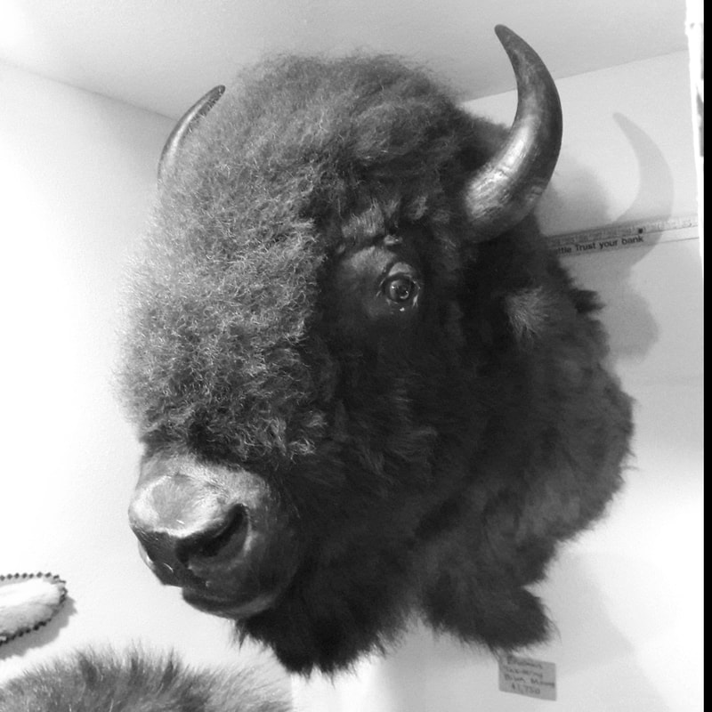
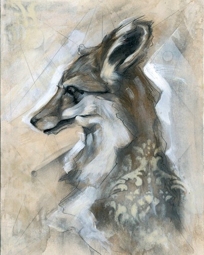
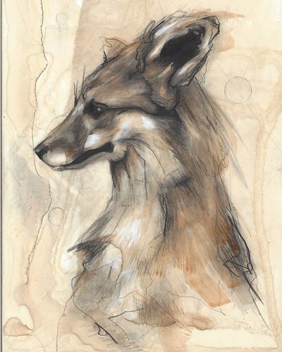
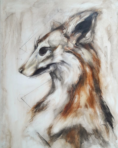
The following images are for another armature exercise, though with a canine subject.
The drawings for the following image should be completed in a 9" x 12 " rectangle (3:4 ratio).
The drawings for the following image should be completed in a 9" x 12 " rectangle (3:4 ratio).
|
| ||||||||||||
Exercise 2.5 - 4
This exercise will use a reproduction of the Venus de Milo for its subject. The rectangle dimensions for this exercise are 16" x 7 " (or approximately 40 cm by 18 cm)
|
| ||||||||||||
2.6- hatching and cross-hatching
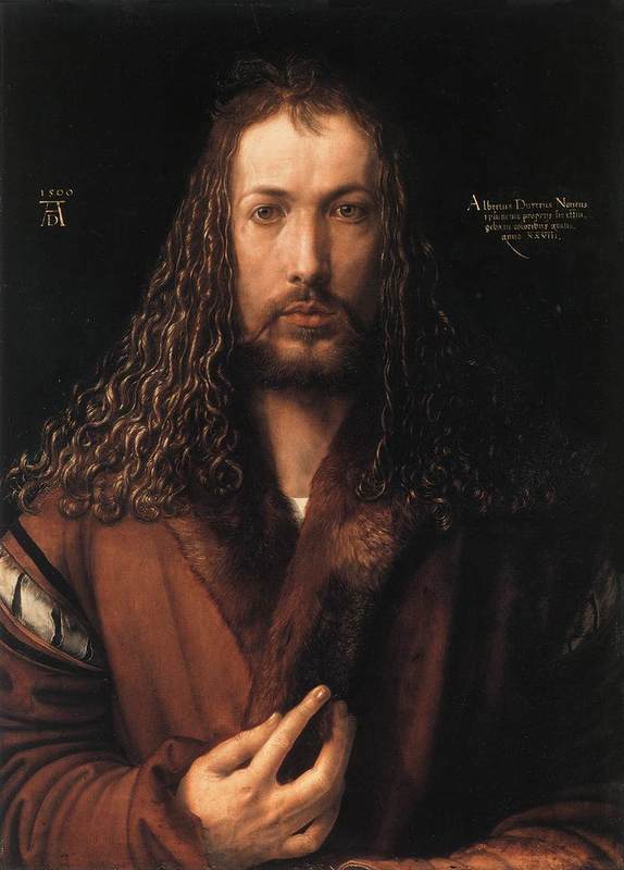
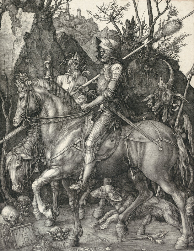
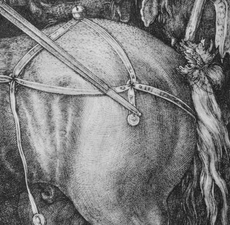
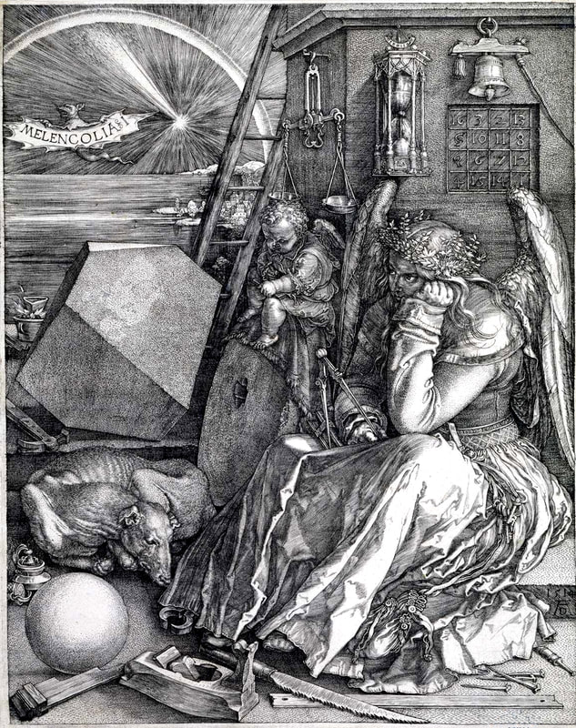
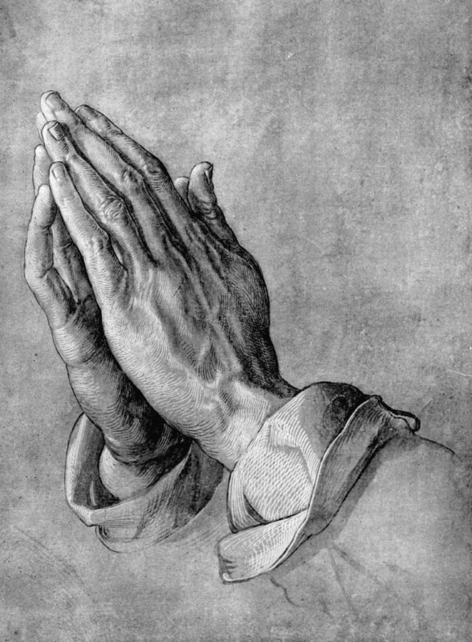
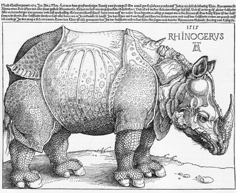
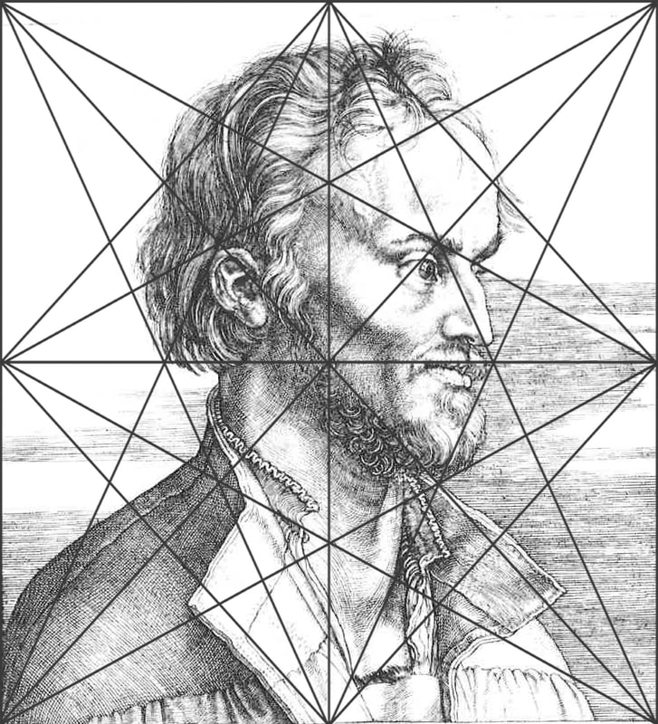
Up until this point we have been using line to describe the perimeter (or contour) of a subject, as well as to describe the different shapes of the shadows within that subject. Now we will begin to explore the use of line in order to describe both value (here meaning the relative light levels) and the surface topography of your subject. By surface topography I mean the shape of your subject. Take a look at the artworks below from the 16th century German artist Albrecht Durer.
The first image in the above gallery is a self portrait of Durer. It's not particularly relevant in regards to the technique we're looking at, but I like to include self portraits as often as possible when we look at the work of a particular artist. In the following four artworks though I would like you to take note about how he uses lines. He's not only using lines to create value, but his lines describe the shape of his subjects surface. If the subjects surface is curved, then so is the line. I often ask my students to imagine wrapping their subjects in thread to help them visualize the process of hatching and cross hatching.
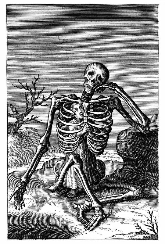
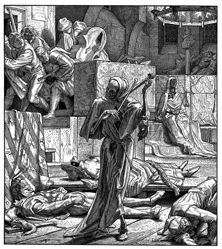
Below you will also find some examples of hatching and cross hatching used in printmaking.
EXERCISE 1
In the above video I demonstrate how to add hatching and crosshatching to a subject. Below is the finished drawing.
|
| ||||||||||||
Below is a supplementary tutorial from comic book artist David Finch.
Portrait of Philip Melanchthon by Albrecht Durer, 1526
EXERCISE 2
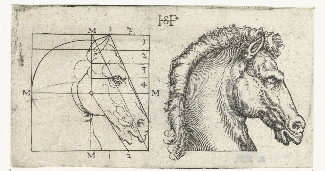
The work above work is a small diagram regarding the stylized proportions of a horses head by German artist Sebald Beham (1500-1550).
The two images below are the ones students should work from.
The two images below are the ones students should work from.
|
| ||||||||||||
Below is an additional video on how to draw fur and hair with an ink pen by artist Alphonso Dunn.
EXERCISE 3
|
| ||||||||||||
EXERCISE 4
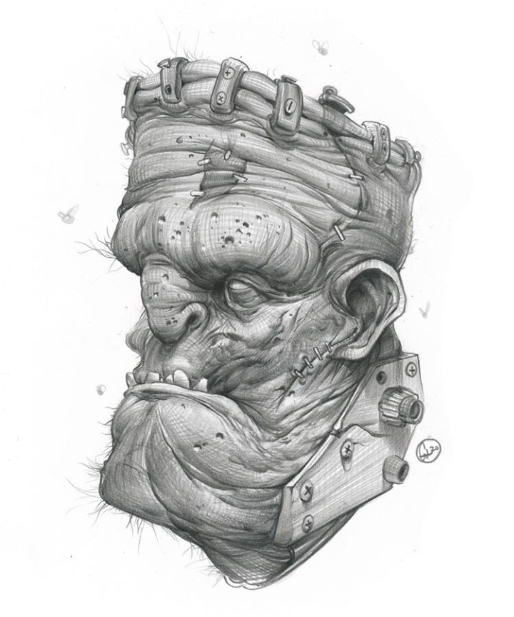
Below is an example of contemporary American artist and illustrator Gary Villareal's hatching and cross hatching work
along with additional files for doing a reproduction.
along with additional files for doing a reproduction.
|
| ||||||||||||
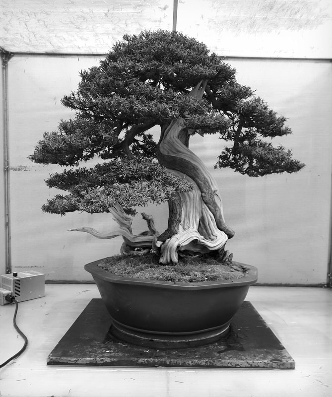
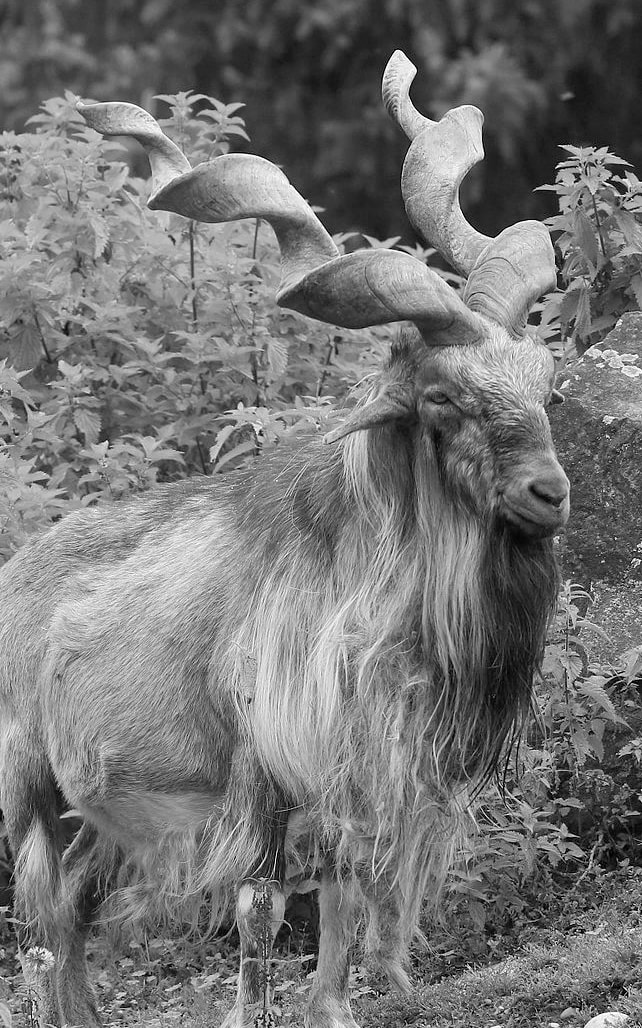
Section 2.7 Intermediate Drawing sources
Below is a selection of images and downloadable files for students to work.
|
|
| ||||||||||||||||||
|
|
| ||||||||||||||||||
|
|
| ||||||||||||||||||
|
|
| ||||||||||||||||||
|
|
| ||||||||||||||||||
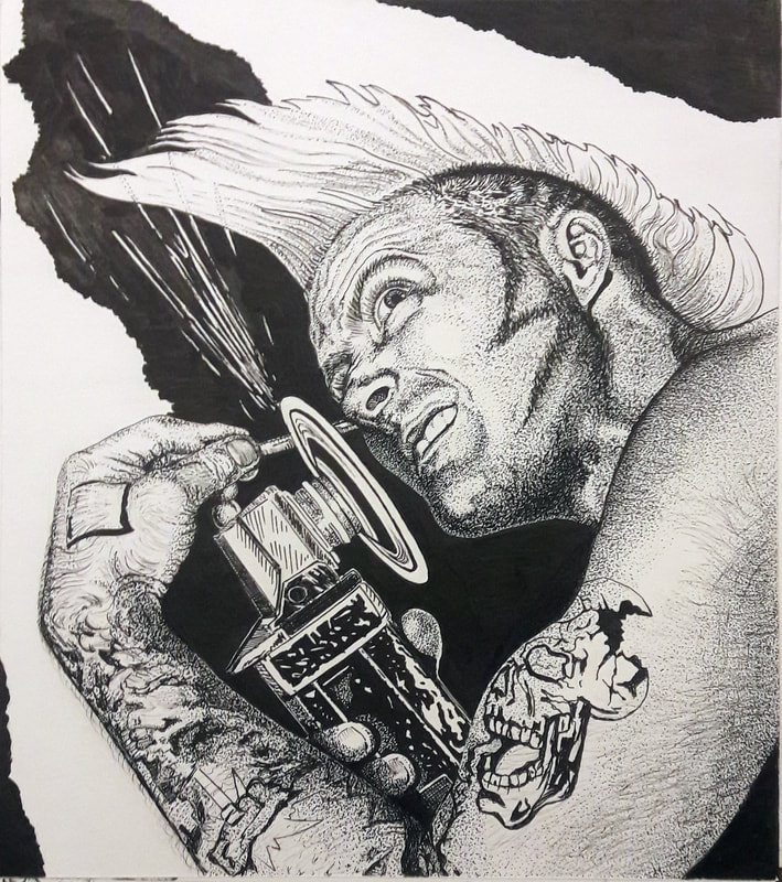
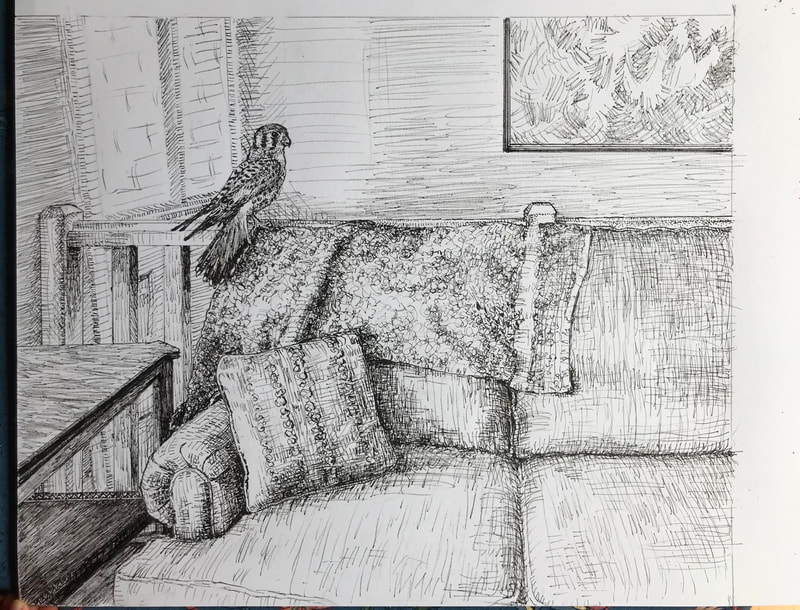
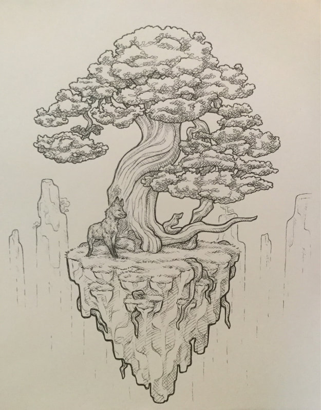
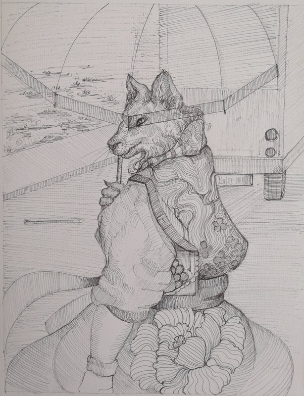
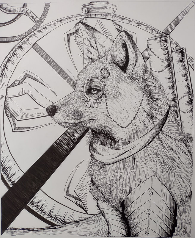
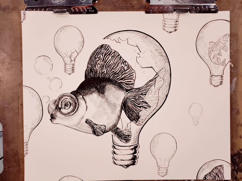
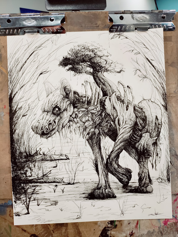
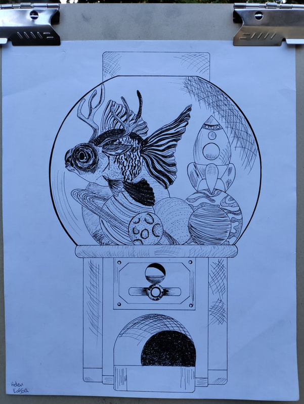
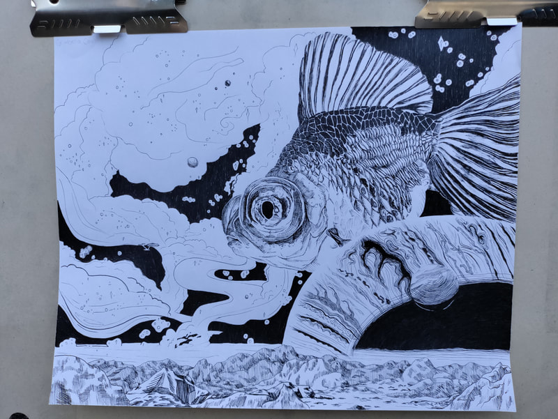
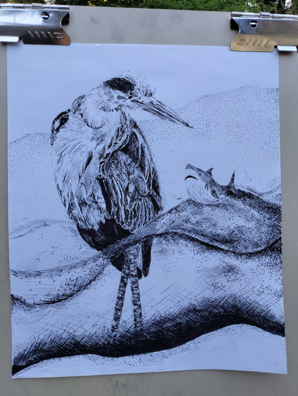
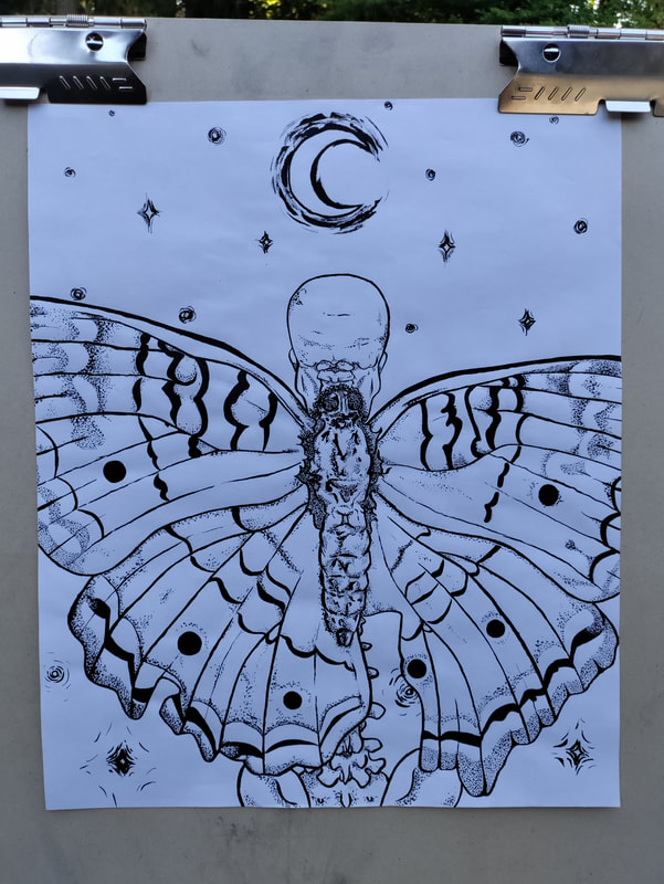
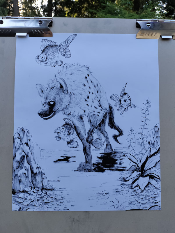
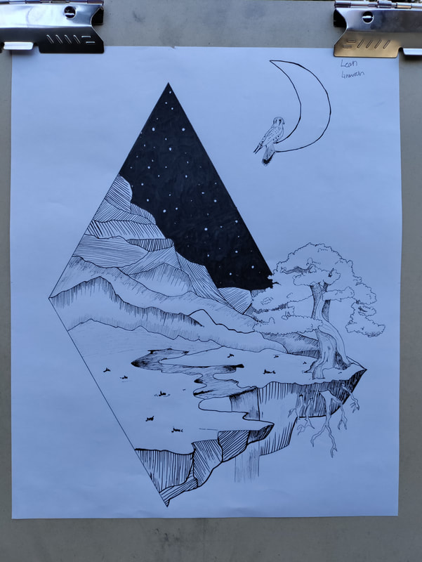
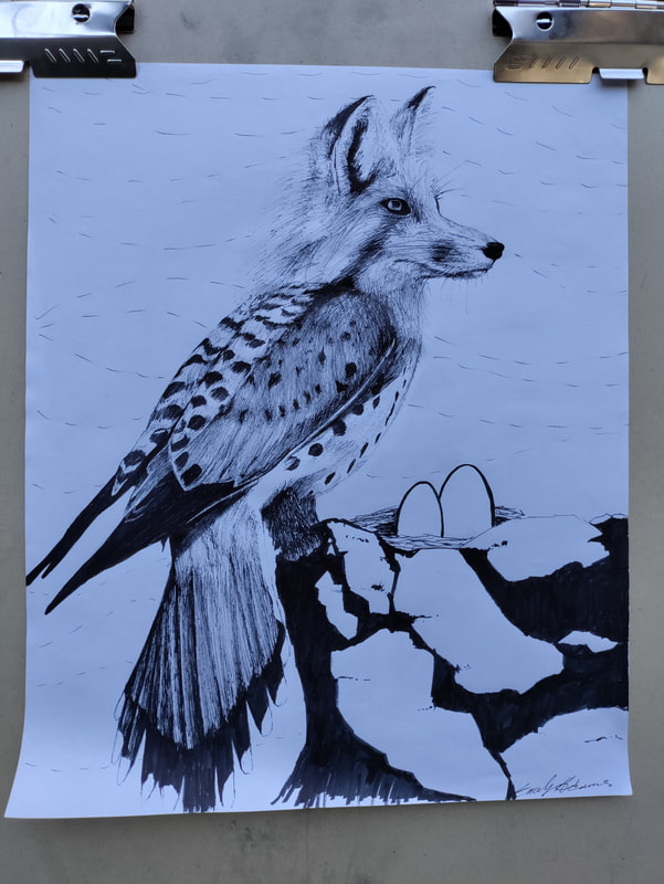
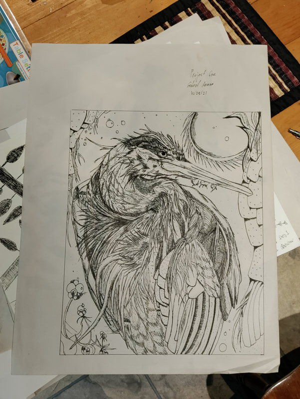
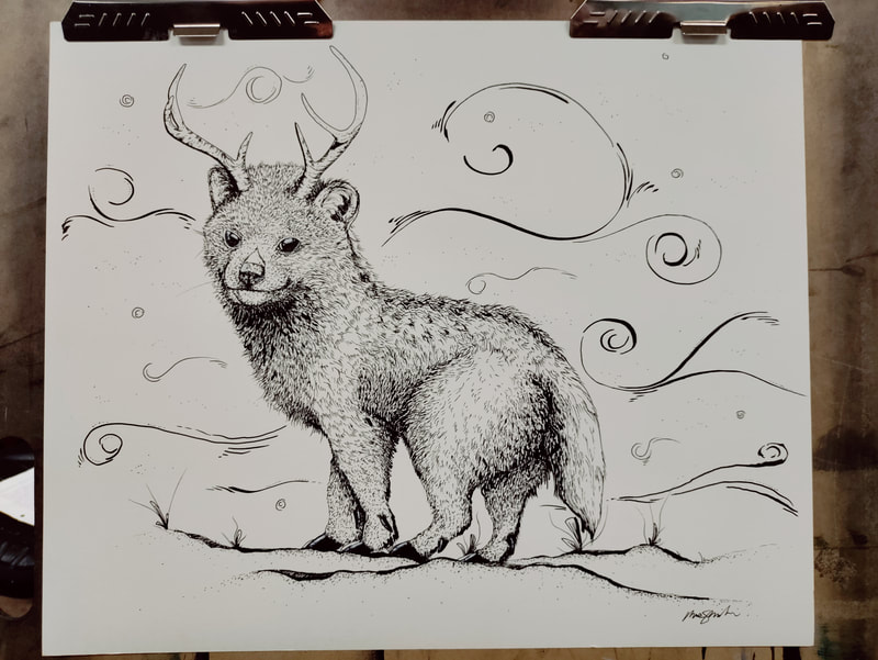
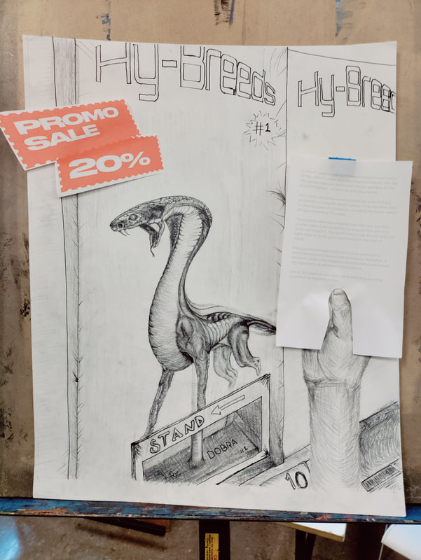
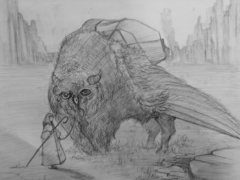
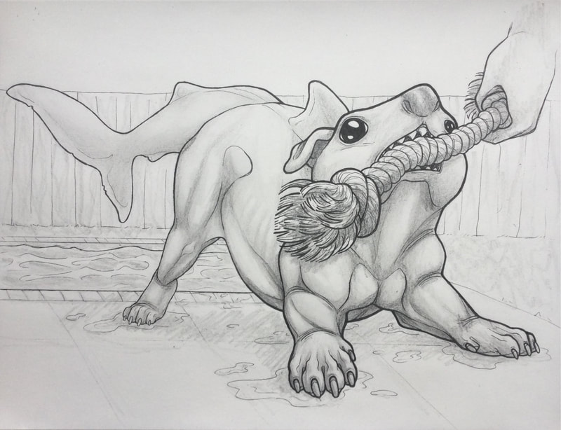
Below are some examples of drawings former students have done using hatching, cross hatching, and stippling with their micron pens on bristol paper.
Perspective and Volume
Section 3
Up until this point we have been looking at line as a way to describe an object, or objects, more or less in isolation. Now we are going to begin to look at different techniques for how to create an accurate or believable sense of three dimensional space on a two dimensional surface using line.
3.1 - Atmospheric Perspective Part One
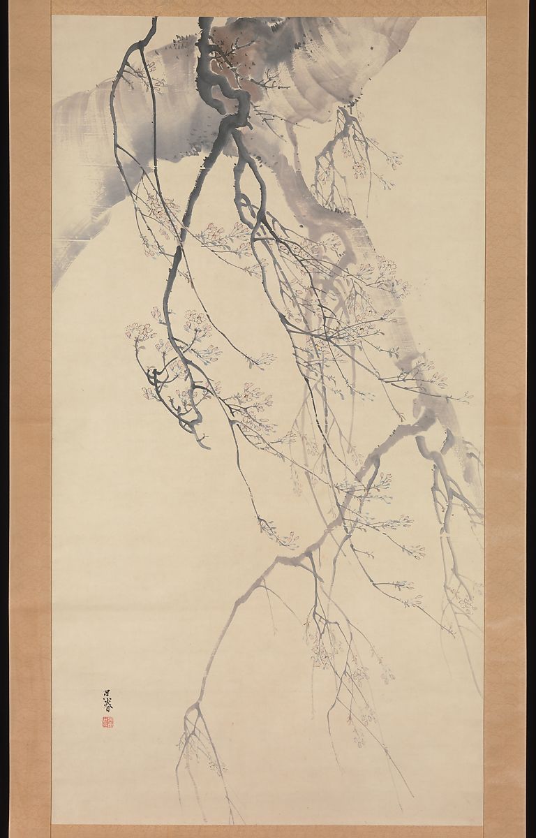
Atmospheric perspective, or aerial perspective as it is sometimes called, is the optical effect which occurs when one looks at objects in the distance through the Earth's atmosphere. Because most the elements in our atmosphere refract blue light, objects at a distance not only appear hazier and less distinct, but they also begin to take on a bluish color.
In the video below I demonstrate how to create a sense of space or depth by utilizing atmospheric perspective and line weight. We'll revisit atmospheric perspective later as we look at value and how to create focus.
3.2 - One Point Perspective
" Chief among the numerous artistic innovations of the Renaissance was the development of a mathematical system to create the illusion of a three-dimensional world on a two-dimensional surface. Theorized by Florentine architect Filippo Brunelleschi in the early 15th century, the concept of linear perspective was first applied in art by Masaccio in a fresco depicting the Holy Trinity for Santa Maria Novella in Florence. The system operates using a horizon line and orthogonal, or diagonal, lines that converge at a vanishing point on the horizon."
- National Museum of Art
- National Museum of Art
The following video is an introduction to, and demonstration of, 1 Point Perspective. Here you will see how to begin building rectangular solids (IE boxes and buildings) using a horizon line, vanishing point, and convergent lines. I would recommend following along in your sketchbook and defining the relevant terms for reference later.
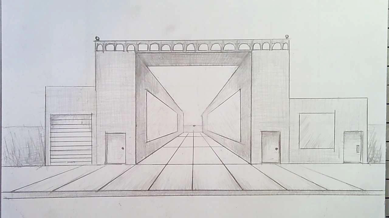
In the time lapse video below I draw a street scene with 2 building connected by a rooftop bridge, including 1 building on each side and a sidewalk. To help convey a sense of depth I make use of aerial perspective. So forms towards the front of the picture plane have deeper a shadows and thicker lines.
Below is the completed drawing for reference. I added some value and texture (grass) on the ground beside the buildings to
help that area read more as a landscape.
help that area read more as a landscape.
3.3 - Two Point Perspective
The following video describes the fundamentals of 2 point perspective. The terms and basic concept remain the same, but with the addition of the second vanishing point we see everything in the scene from an angle rather than head on.
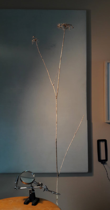
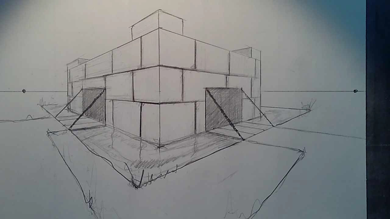
Below is a time lapse drawing of a small stone fort surrounded by a moat and a path that meets from the 2 entrances. You can see that I start with a rough and quick sketch just to get a idea of what my subject will look like before I begin constructing it in two point perspective. Quick and loose sketches should always precede a drawing that you'll be spending a good amount of time on. This allows you to work through some of your ideas in a no pressure environment, while also warming up your hand and eye to work together more accurately. In a introductory class room environment students typically produce 5-6 drawings per day within a 3 hour class to begin to build the muscle memory and acuity required to effectively render a subject, whether that subject be from observation or imagination.
It's especially important for me to note for my introductory students that in this drawing, outside of the chains and the grass, every diagonal line is convergent. I often receive drawings from students where they have drawn lines that they know to be parallel, such as the top and bottom of a doorway or window, as parallel on their page. This is ok only when you've drawn a wall something that is parallel to the picture plane, and that's not something we'll be doing for any of our two point perspective drawings. If a plane is skewed, that is if it is seen from any other angle than parallel to the picture plane, then all of it's diagonal lines will be convergent.
3.4 - 3 point perspective
The final linear perspective technique covered her will be three point perspective. These drawings are often described as either a "birds eye" or "worms eye" view meaning that the subjects are either created from the vantage point of looking down or looking up at them. Below are two tutorials for creating three point perspective drawings from either view. Both are wonderful tutorials but students are encouraged to always use a ruler for linear perspective exercises rather than free handing your drawing as the narrator does here.
3.5 - Semi-Complex forms in linear perspective
This section will address how to create some semi-complex forms in linear perspective.
3.6 - Volumetric drawing Intro
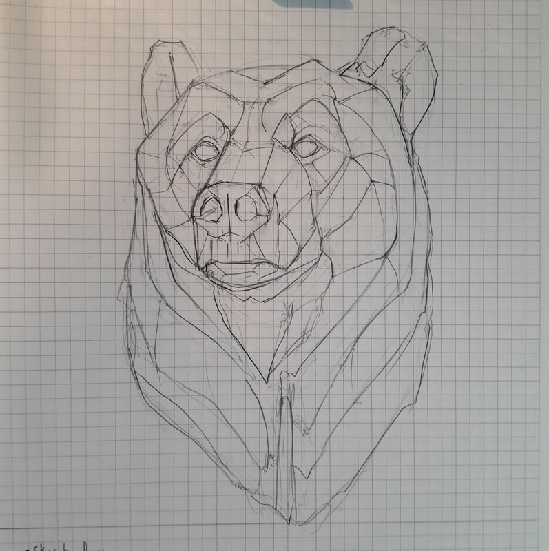
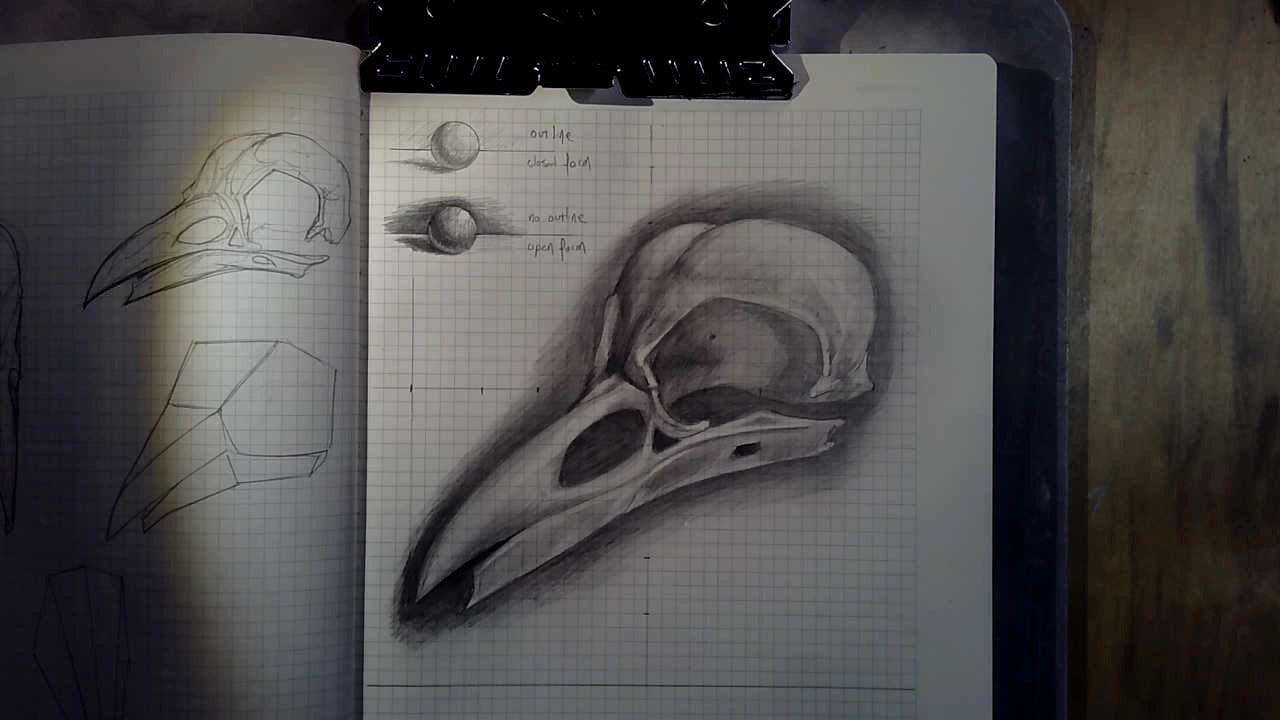
This final section deals with volumetric and planar drawing. I like to include it in the section on perspective, as by now students should have some basic understanding of how to render simple or semi complex geometric forms. In my consideration, this approach is by far one of the most essential drawing techniques for rendering a subject in Illusionistic space.
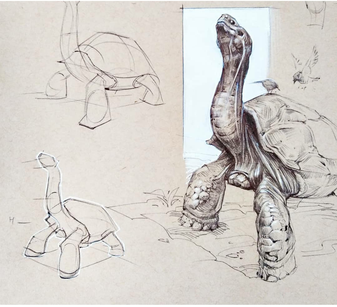
In the first video I introduce the concept as I flip through one of my sketchbooks. In the video following that I demonstrate how to render a subject as simplified geometric planes.
In the first video I introduce the concept as I flip through one of my sketchbooks. In the video following that I demonstrate how to render a subject as simplified geometric planes.
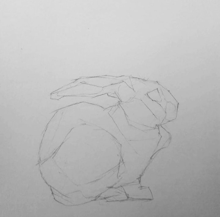
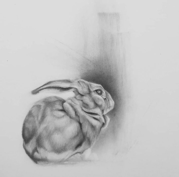
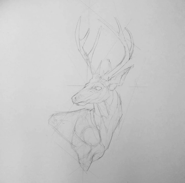
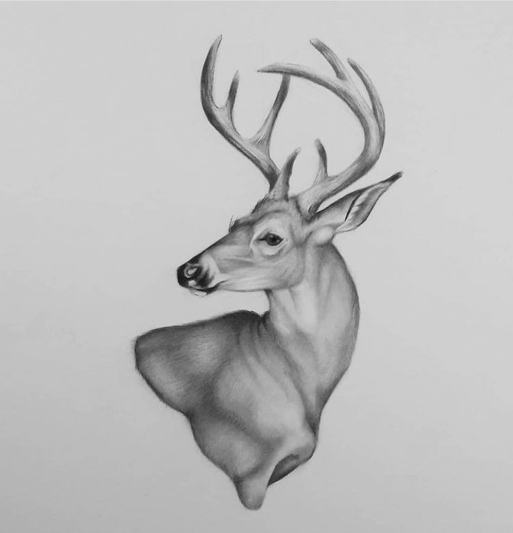
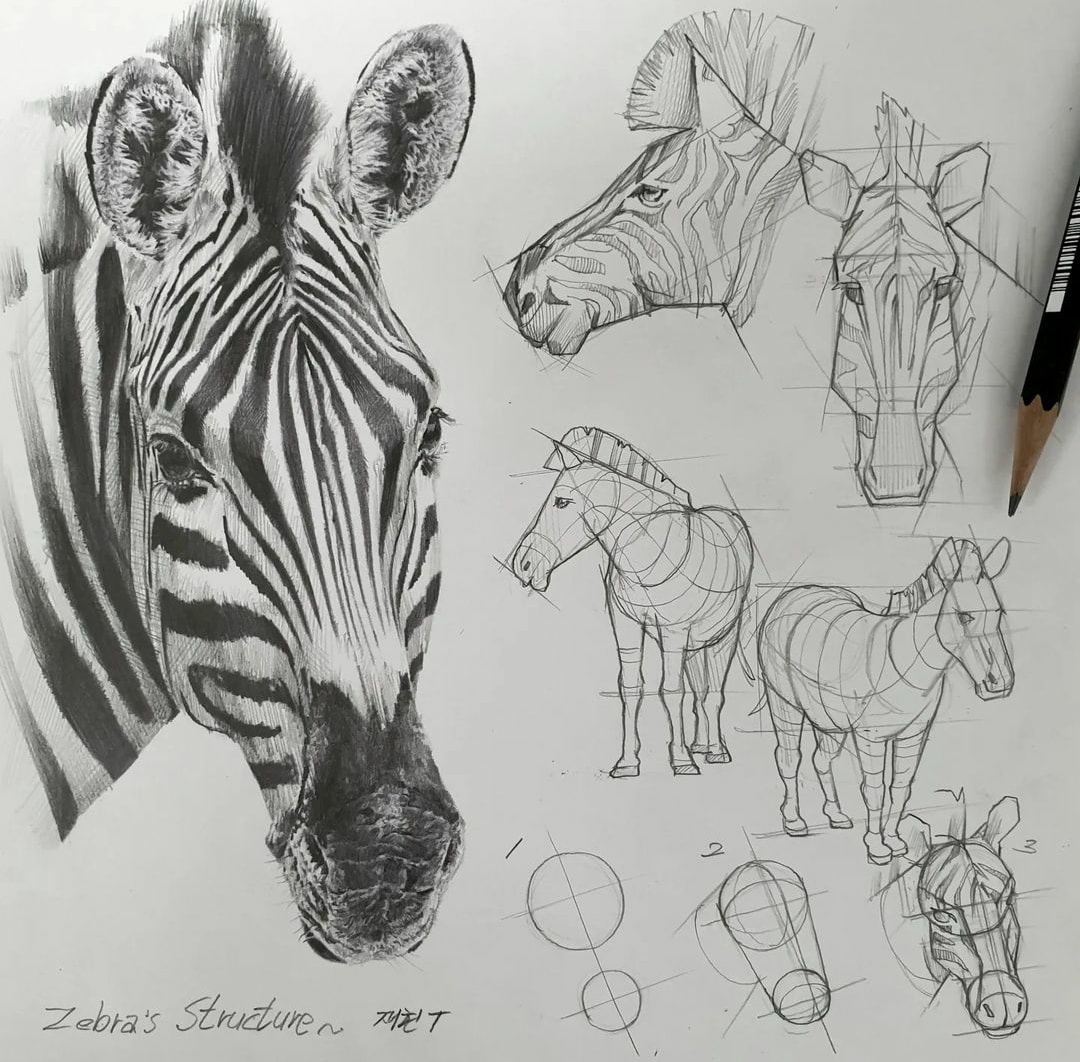
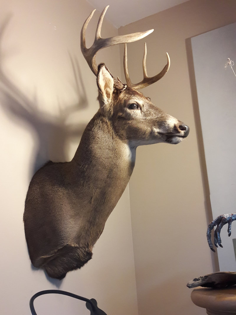
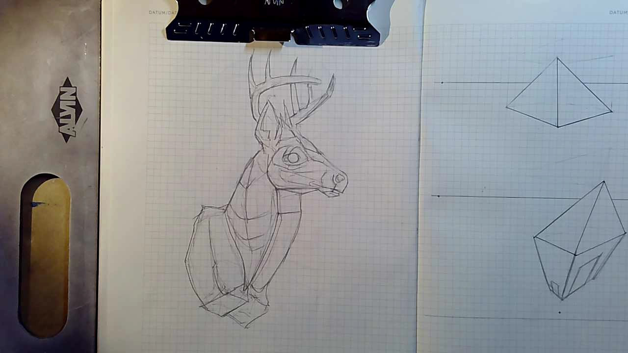
Below are two drawings of a rabbit and a stag that I recently did. On the left you'll see the structural/planar drawing and on the right you can see the finished work.
Of the two the rabbit structural drawing is the simpler as it was just a quick study. The stag was part of a larger series of drawings and so required a more detailed structural drawing. In the first stag drawing you can also see how I overlaid a complex contour drawing to note changes in light and how hose matched with topographical shifts.
Of the two the rabbit structural drawing is the simpler as it was just a quick study. The stag was part of a larger series of drawings and so required a more detailed structural drawing. In the first stag drawing you can also see how I overlaid a complex contour drawing to note changes in light and how hose matched with topographical shifts.
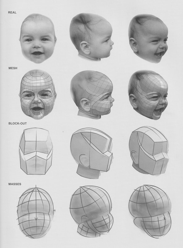
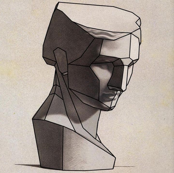
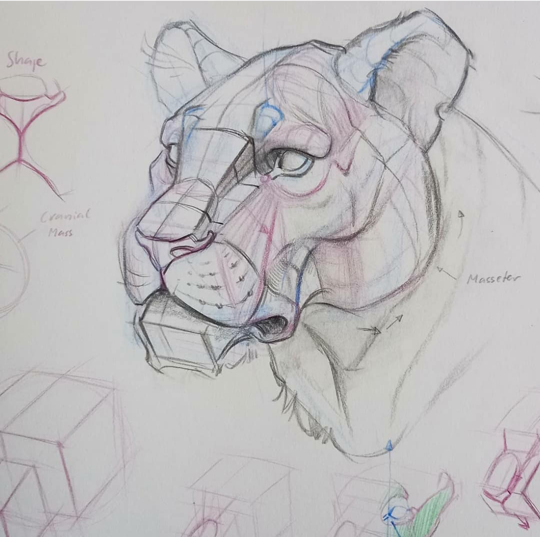
Below are different examples of structural model from the book Anatomy for Sculptors.
The following two images are contemporary artist Stephen Bauman. In them he demonstrates how to simplify the planes and local value of a cast drawing.
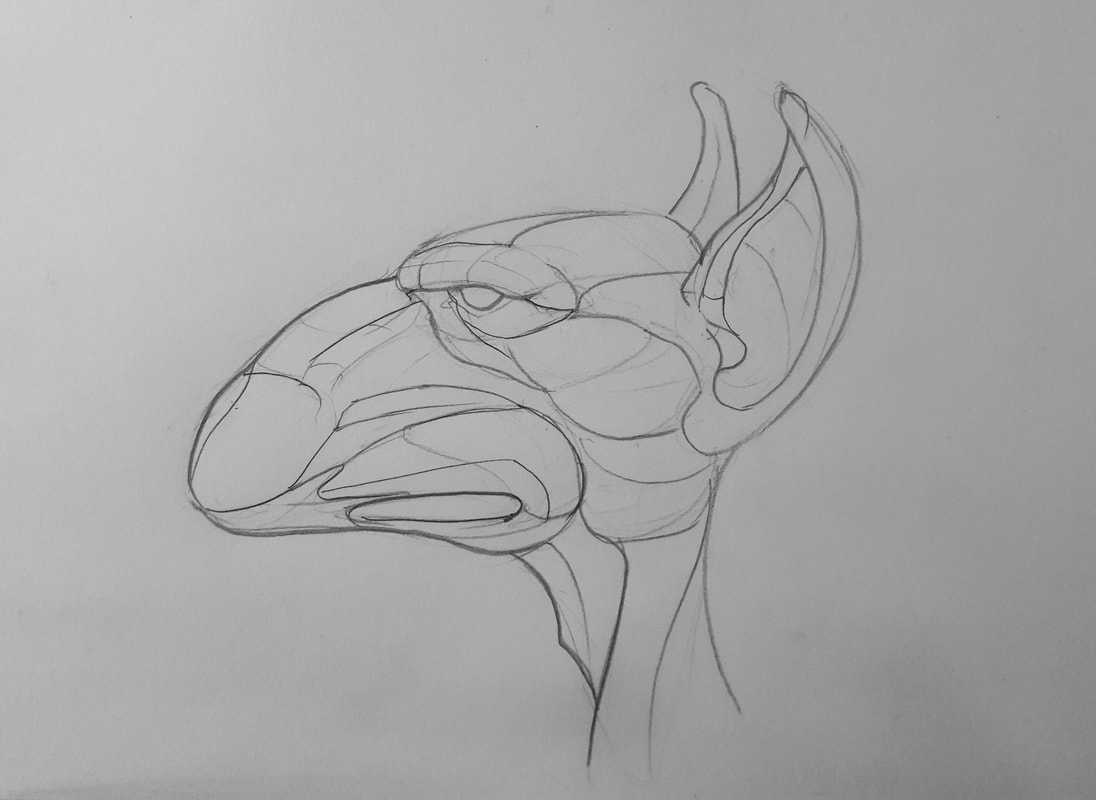
Below is a series of drawings by An Jay Hyun (anjjaemi on Instagram) showing the stages of refinement from simple volumetric shapes into more complex planar forms, before being completed with even more subtle shifts in the surface and value.
The examples below are from artist and instructor Thomas Kleinburger.
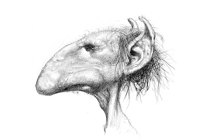
The final example in this introductory section shows how I've broken down a drawing of creature called the Killmoulis from the illustrator Alan Lee's 1978 book entitled Faeries. Lee later went on to do much of the concept work for Peter Jackson's Lord of the Rings trilogy.
3.7 Volumetric Drawing from 3D observation
Below is the completed drawing from the video.
3.8 Volumetric drawing from 2D observation
Exercise 1
Above is a close up of a Yellowstone grizzly bear (Ursus arctos horribilis). In the time lapse video below I demonstrate doing a volumetric drawing based off of it.
Above is the completed volumetric drawing of the grizzly. Below are images and files for students to work from.
|
| ||||||||||||
Exercise 2
|
| ||||||||||||
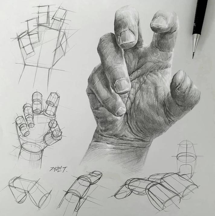
3.9 Structural Hand Drawings
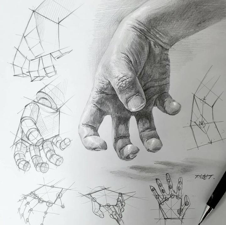
Above are two structural drawings of hands by Korean artist Anjjaemi
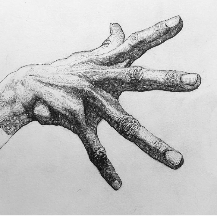
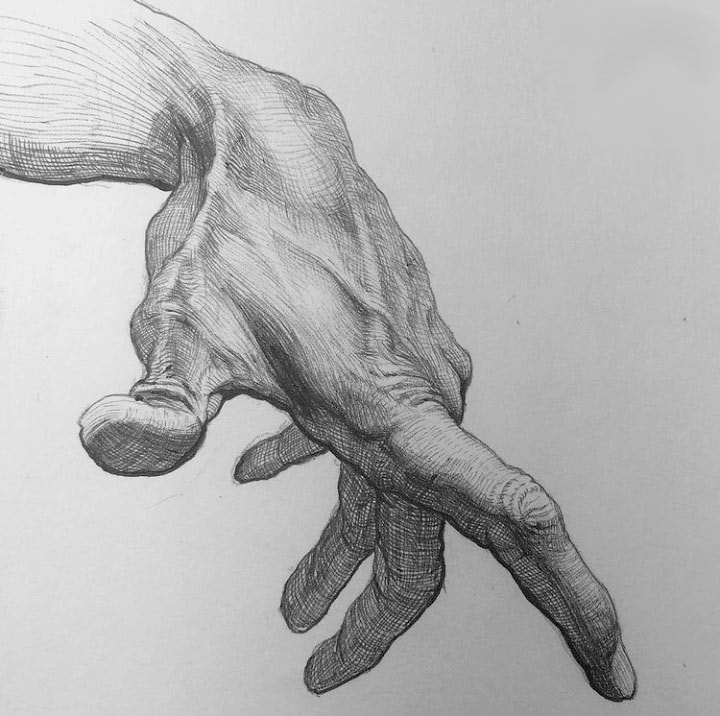
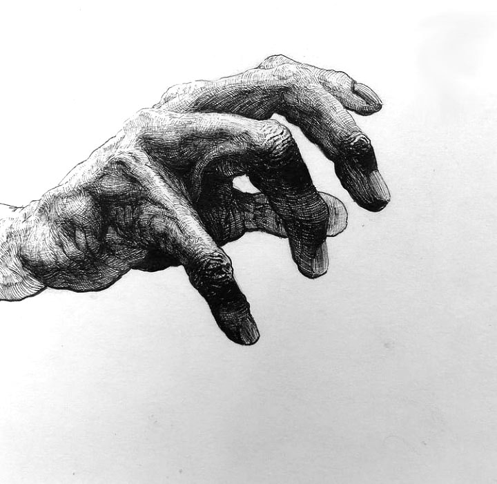
Below are three hands drawn by Alphonse Dunn for students to practice with.
Below are three hands drawn by Alphonse Dunn for students to practice with.
3.10 Subverting Form
Intro Value
section 4
"The illusion of three-dimensionality is the domain of the halftones, that small band of values that bridge the shadow and the light."
-Juliette Aristides, "Classical Drawing Atelier"
-Juliette Aristides, "Classical Drawing Atelier"
4.1 Intro To value
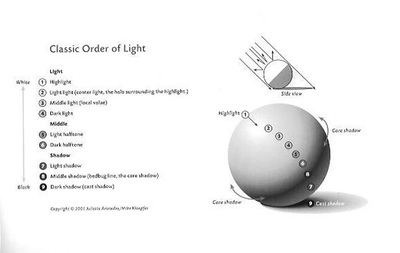
Throughout this section we will be exploring a more thoughtful approach to introducing value to your drawings. We've covered it earlier with hatching and cross hatching, but only on a basic level. Throughout the video tutorial I'll be referring to the three graphics below, so take some time to look at them and read the captions.
4.2 Value from 3D observation
The following pictures revisit our earlier course materials regarding still life set up and the stages of a drawing as we prepare for adding value. Each one is captioned.
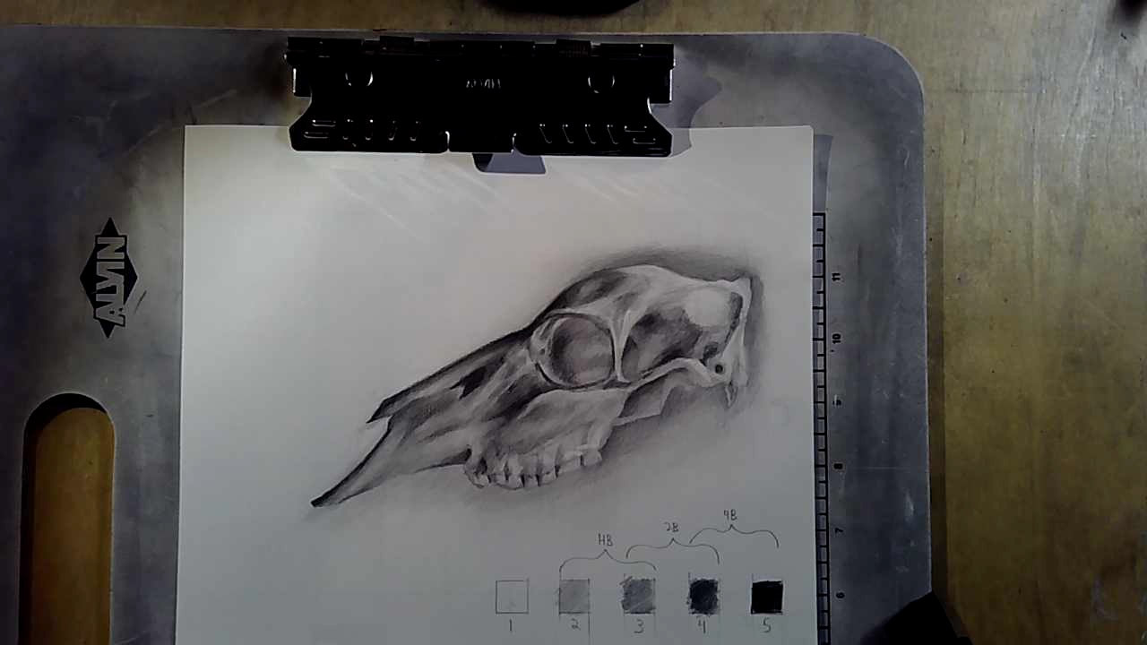
A quick note on my value scale, I noticed after recording this that my number 4 and 5 values look very similar in the 5 boxes I drew. They look that way because my camera is reading the light a little differently than my eyes were. The contrast in general for these videos is a little higher than what you might see drawing this subject "in person." This is a good segue for me addressing lighting conditions in your drawing space. Our eyes are constantly adjusting to the light levels around us as conditions change, so it's helpful to have a controlled lighting situation when you're drawing. In studio classes this is usually carefully monitored, so when working remotely you make an effort to be conscious of this. If you are working next to a window, then over the course of your drawing the light will change, so things will appear differently to you towards the end of the drawing. This is also a good reason to spend a few minutes just looking at your subject before you begin drawing. You'll have time to think about what it is you're drawing and to let your eyes adjust.
Above is the time lapse drawing of the drawing below. This was roughly a one hour drawing.
4.3 value from 2D Observation
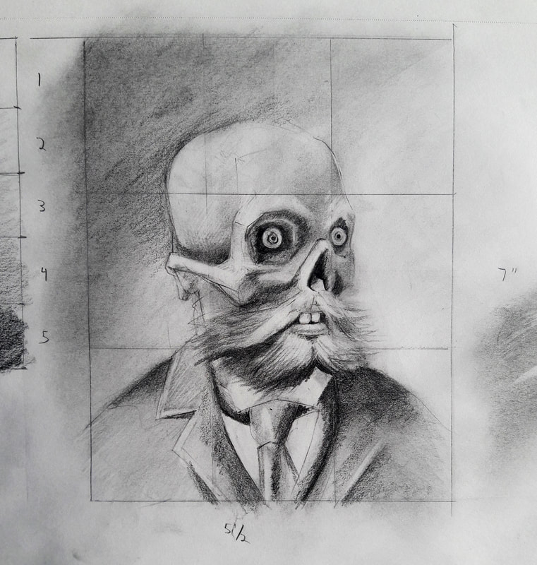
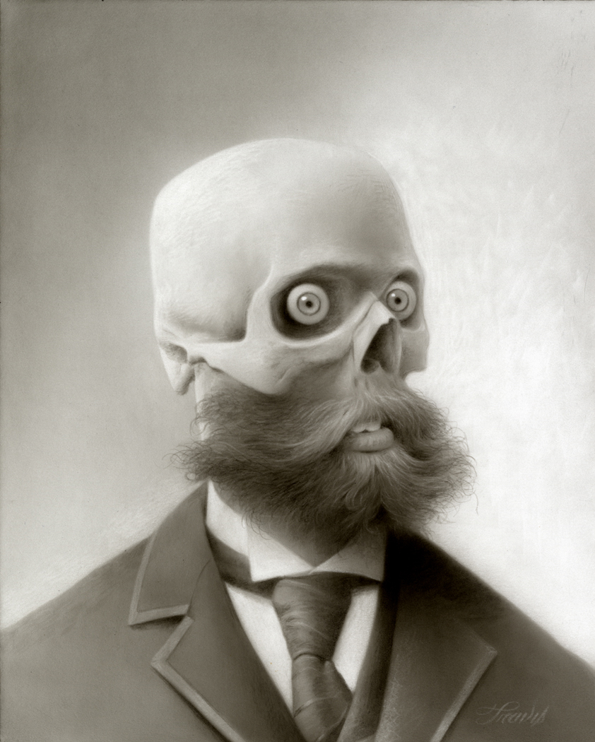
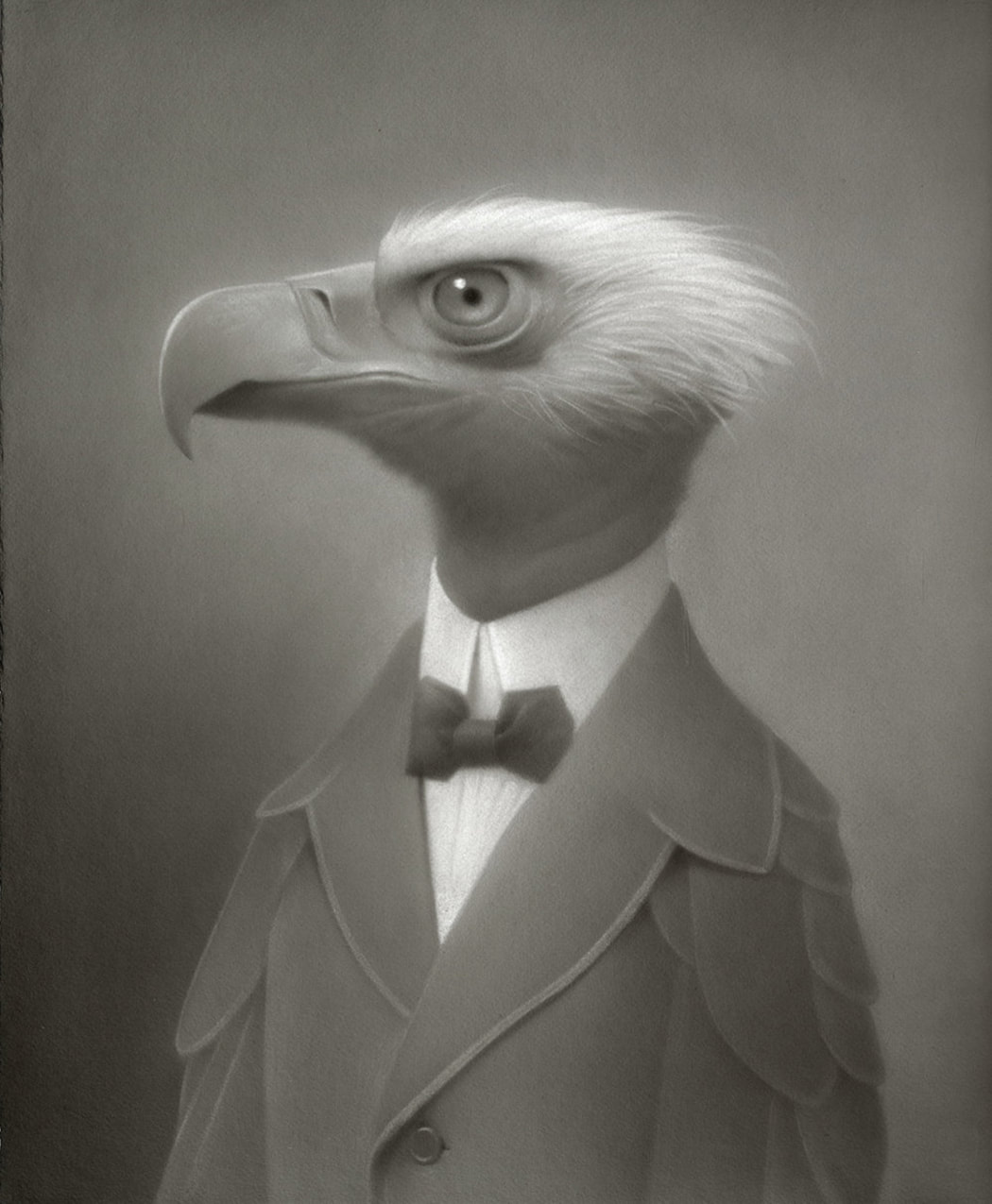
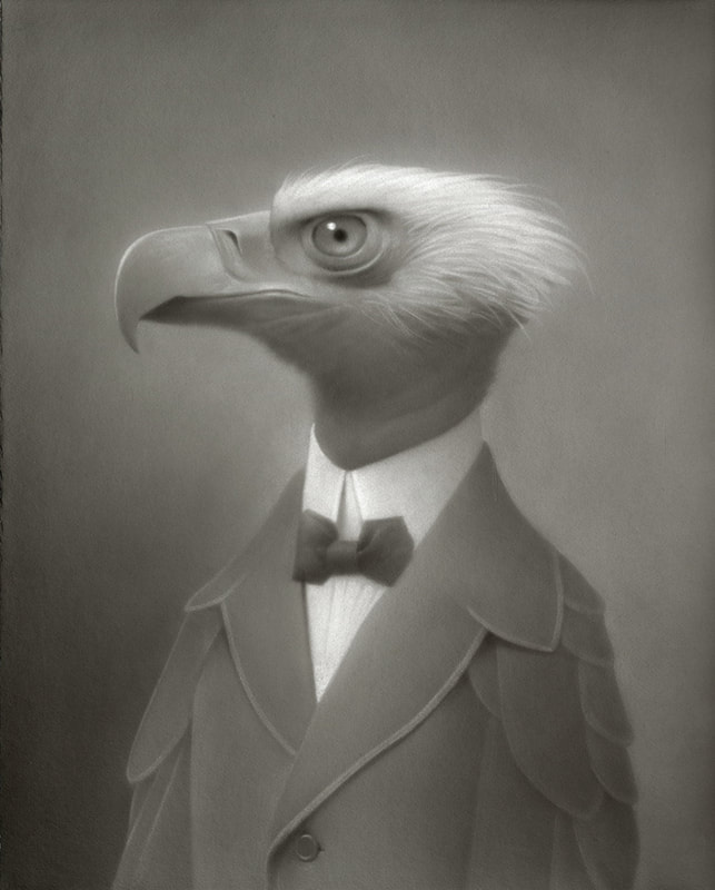
For my tutorial on reproducing a 2D subject I have chosen the drawing Uncle Arthur by the California based contemporary artist Travis Louie. Louie's professional artistic practice typically incorporates some type of surreal or humorously grotesque subject as though they are posing for a Victorian era tintype or other early photograph. He often accompanies these pictures with small stories that explain the absurd background of the person or persons "posing."
Below I set up the demo for creating a toned drawing for this reproduction. Following that is the timelapse of me finishing the drawing.
Below you will find images and files to work from for your assignments.
|
| ||||||||||||
|
| ||||||||||||
|
| ||||||||||||
4.4 Open form Drawing from a 3D Subject
The first thing I would like to address is that the two techniques I am going to cover in this section are not in opposition, as the "versus" in title might suggest. contemporary illusionistic drawings and paintings often make use of both approaches. They are both just different parts of a technical vocabulary for you to express yourself. Here we will be contrasting the two and looking at examples of both, with an emphasis on creating open form drawings as this is the next step in the progression of techniques for this course.
One thing to note is that I also used a soft cotton rag to tone the entire drawing around the 33 second mark.
4.5 Open Form Drawing From A 2D Subject
Exercise 1
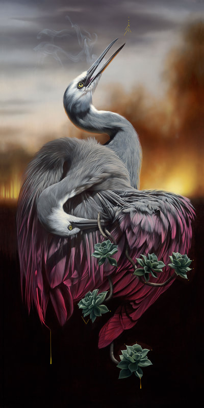
Josie Morway, Propagate, Oil and enamel paint on panel
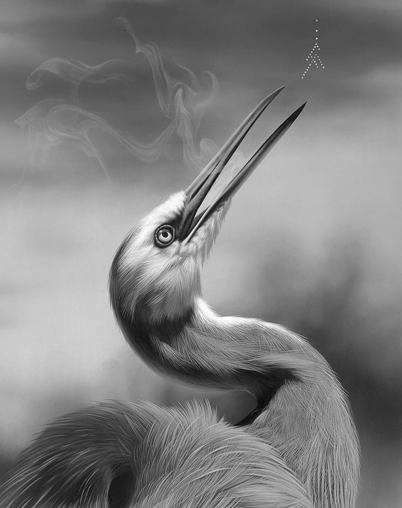
Above is the gray scale detail of Propagate that we will be working from for this section.
Below are the images and file with the armature and grid available for download.
Below are the images and file with the armature and grid available for download.
|
| ||||||||||||
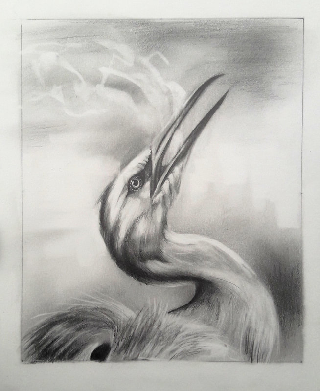
Below is my first of 3 videos on doing an open form drawing from a 2D source. In it I talk about the relationship between value and structure,
and the importance of an accurate underdrawings.
and the importance of an accurate underdrawings.
Below is the time lapse drawing of my master copy. This took about an hour and a half with a short breaks to stretch.
In the final video I cover my materials and techniques and define what an open form drawing is again.
Below is a photo of the completed study. It was taken around noon on an overcast late fall day.
Exercise 2
|
| ||||||||||||
Exercise 3
|
| ||||||||||||
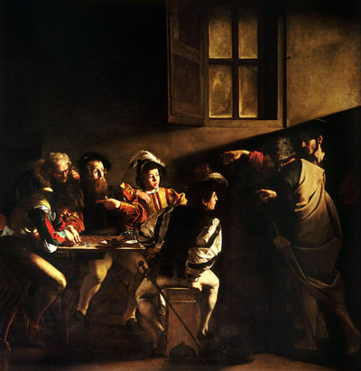
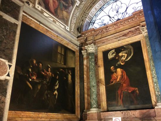
4.6 Examples of Chiaroscuro in Italian Painting
Composition
Section 5
" In short, order and beauty in sound are determined by the musical root harmonies, which in turn are the result of a natural phenomenon that occurs when certain physical intervals of vibrations are produced. These intervals of vibrations (or notes) that create pleasurable sounds are measured by ratios. The string does not create its own order; instead, it provides us with an example of an existing subtle universal or cosmic order that is hard to see on a small scale but that is profoundly felt."
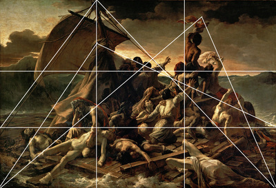
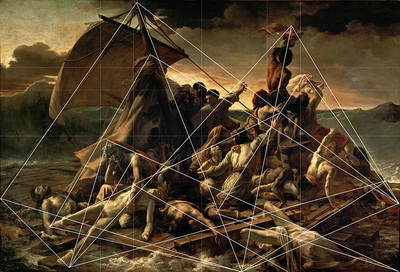
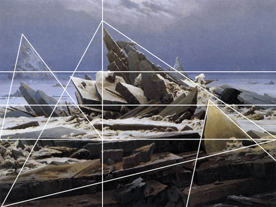
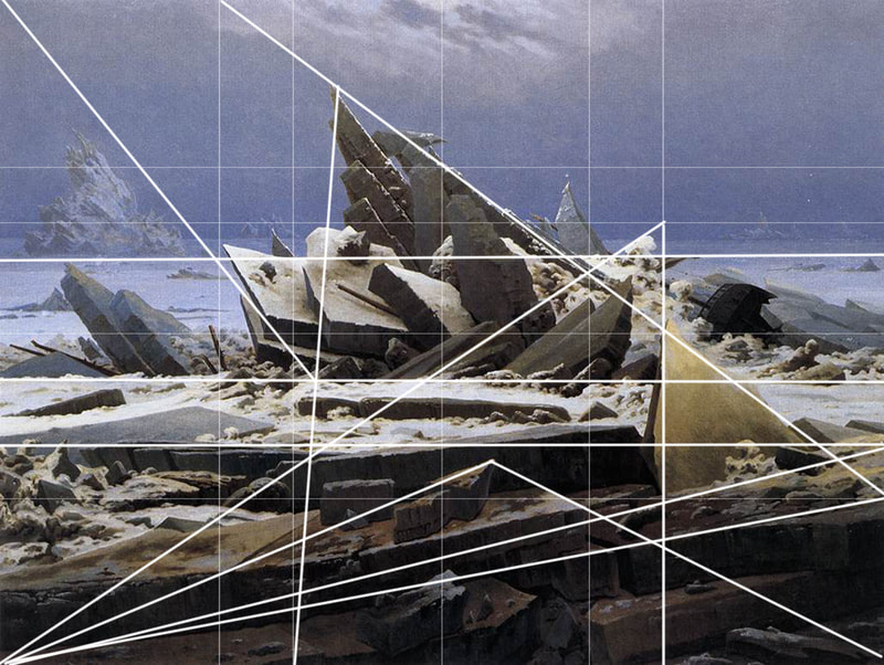
"The combination of the rectangle and its diagonals provide a simple means of determining harmonic divisions, for when fourteen diagonal lines are superimposed upon a rectangle, a compositional grid is formed; the intersections of these diagonal lines determine the location of the harmonic divisions.... This armature provides the limits of composition, and within these limits, compositions can be varied endlessly. The importance of the armature of the rectangle is paramount to an artist. It's meaning should be understood and it's construction should be memorized until it becomes second nature. This is the musical scale of composition."
- Juliette Aristides, "Classical Painting Atelier "
